whats new...
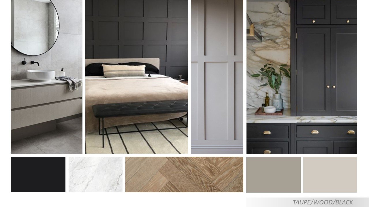
latest property renovation is about to hit the market! for this one we decided on a slightly different colour palette and introduced some warmer tones. check out the moodboard below.
as with all renovations we have to get a balance - we want the potential buyer to be wowed by the property, but they also need to be able to see how they can live there and how they can put their own mark on it, so it cant be too crazy?!
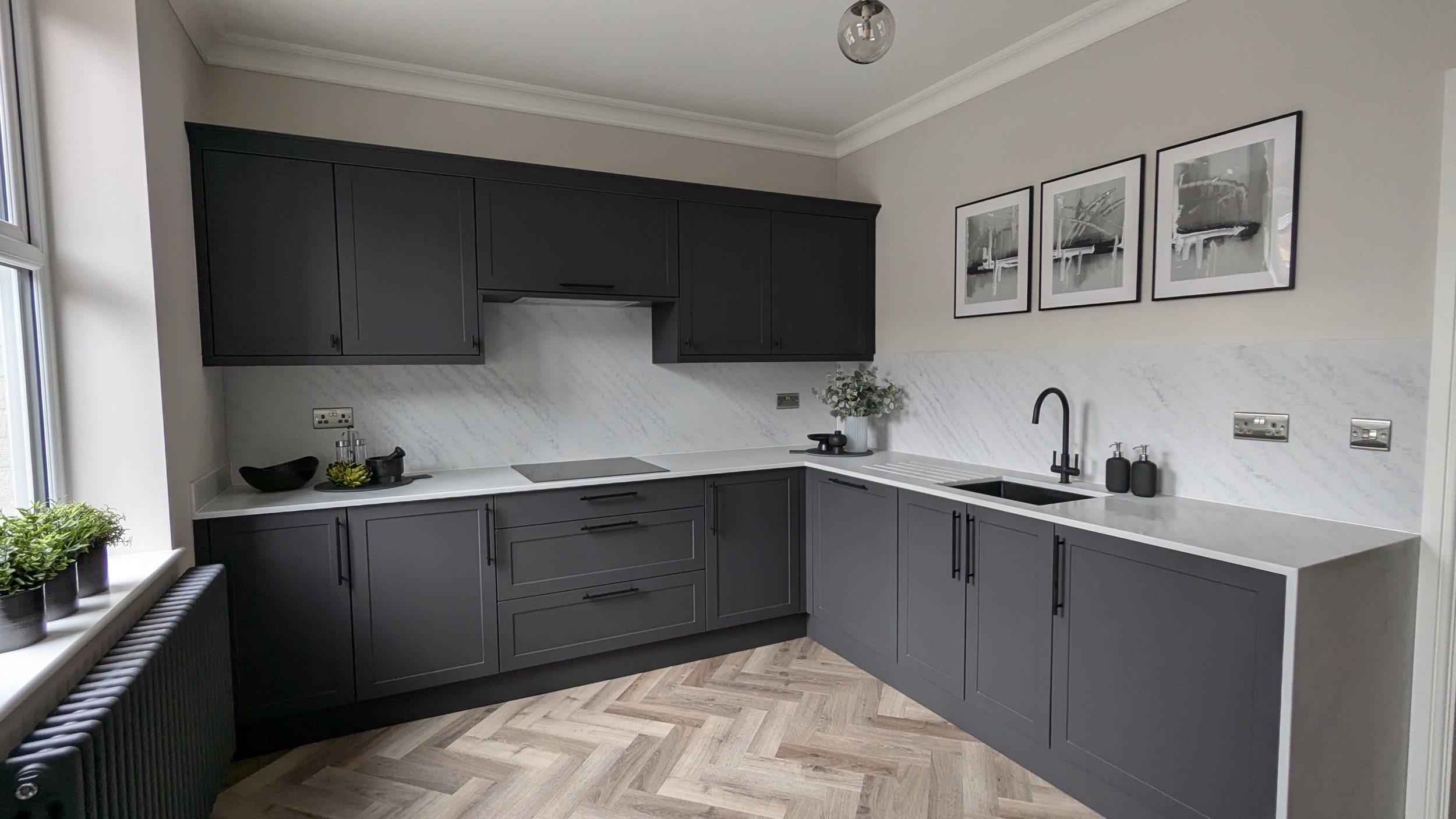
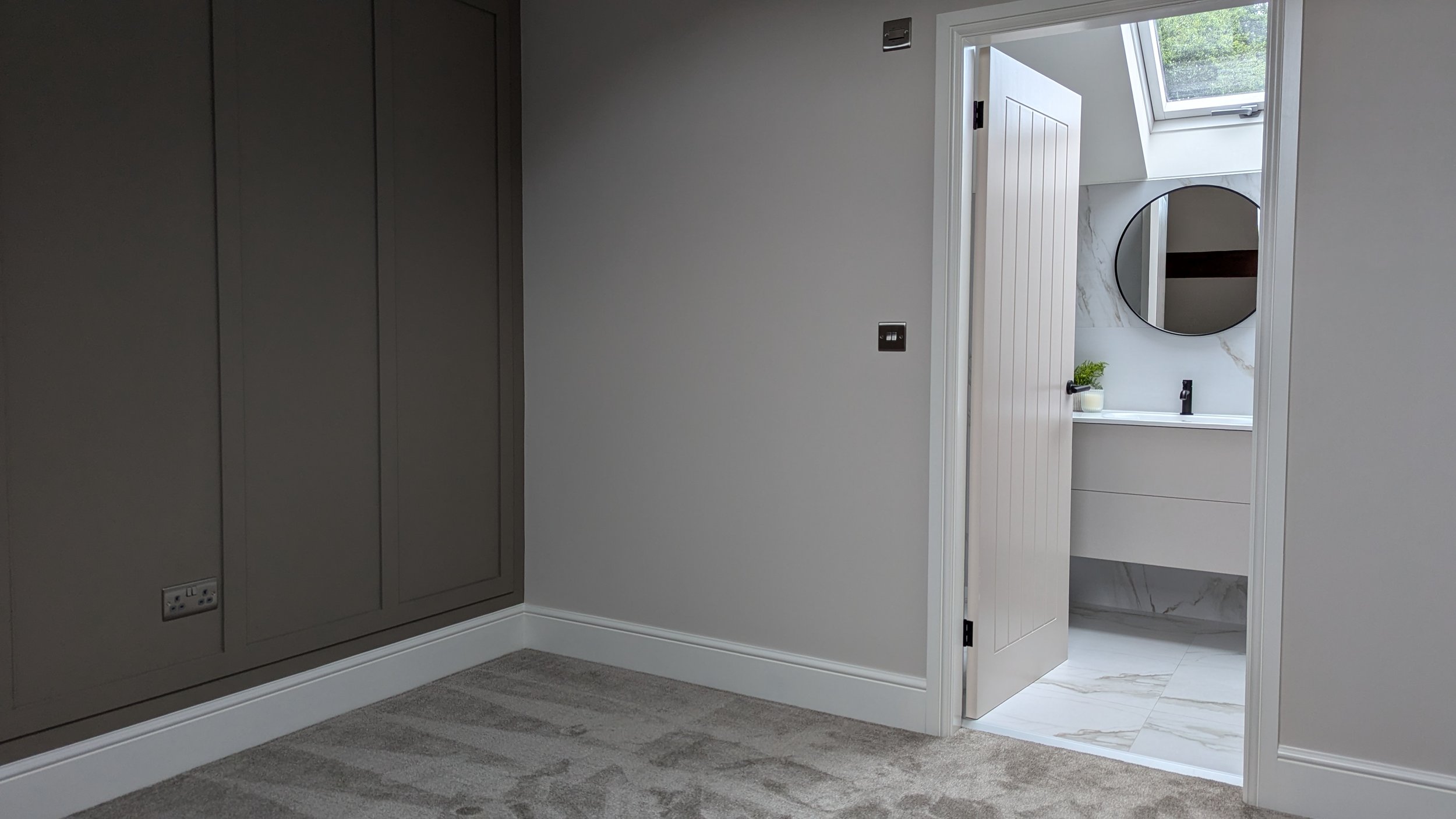
to make this property stand out we have focused on quality kitchen and bathroom finishes and added feature panelling in the main bedroom and living area. the general colours throughout create a great base with impact in key areas.
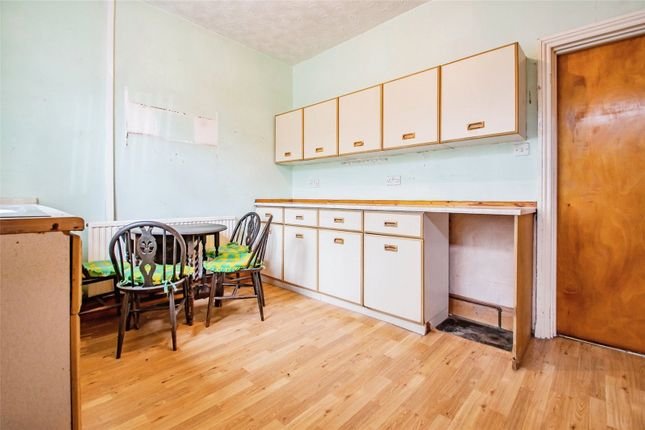
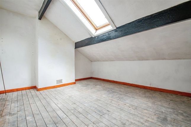
by adding ceiling roses, coving and some quality feature lighting the property is elevated to another level. we style key areas to add warmth and interest - allowing potential buyers a glimpse of how they can use the space. have a look at the before and after photos below.
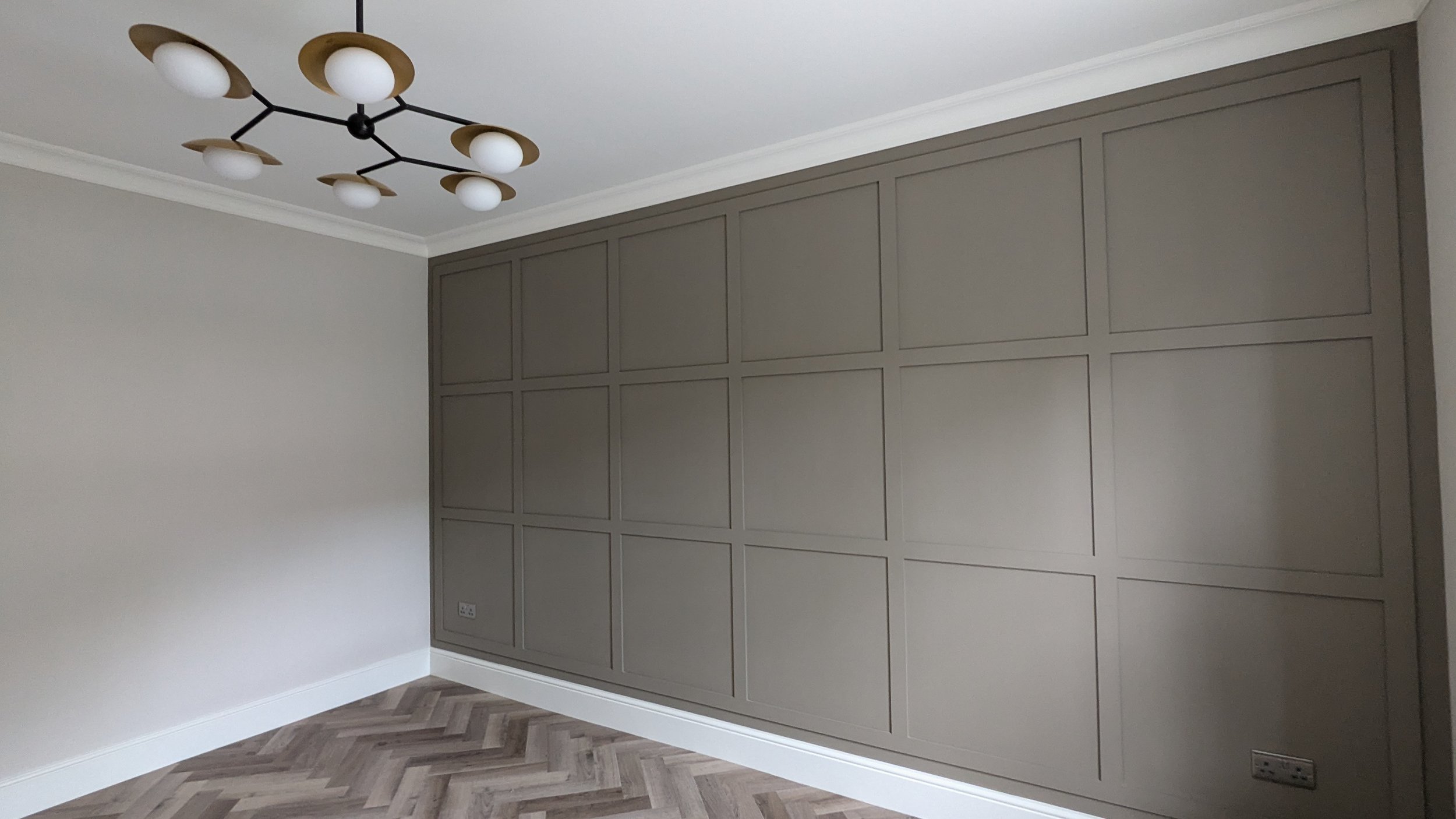
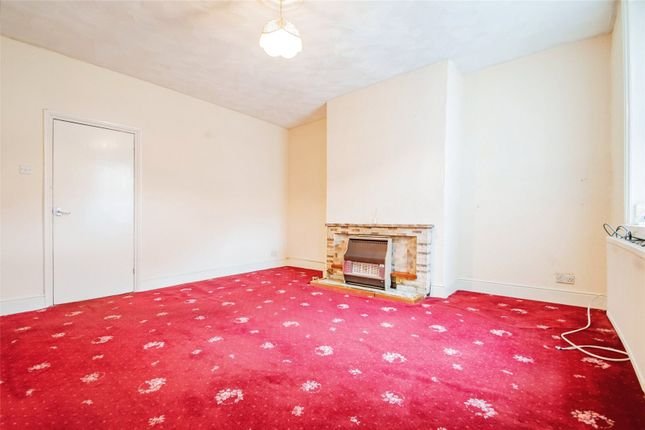
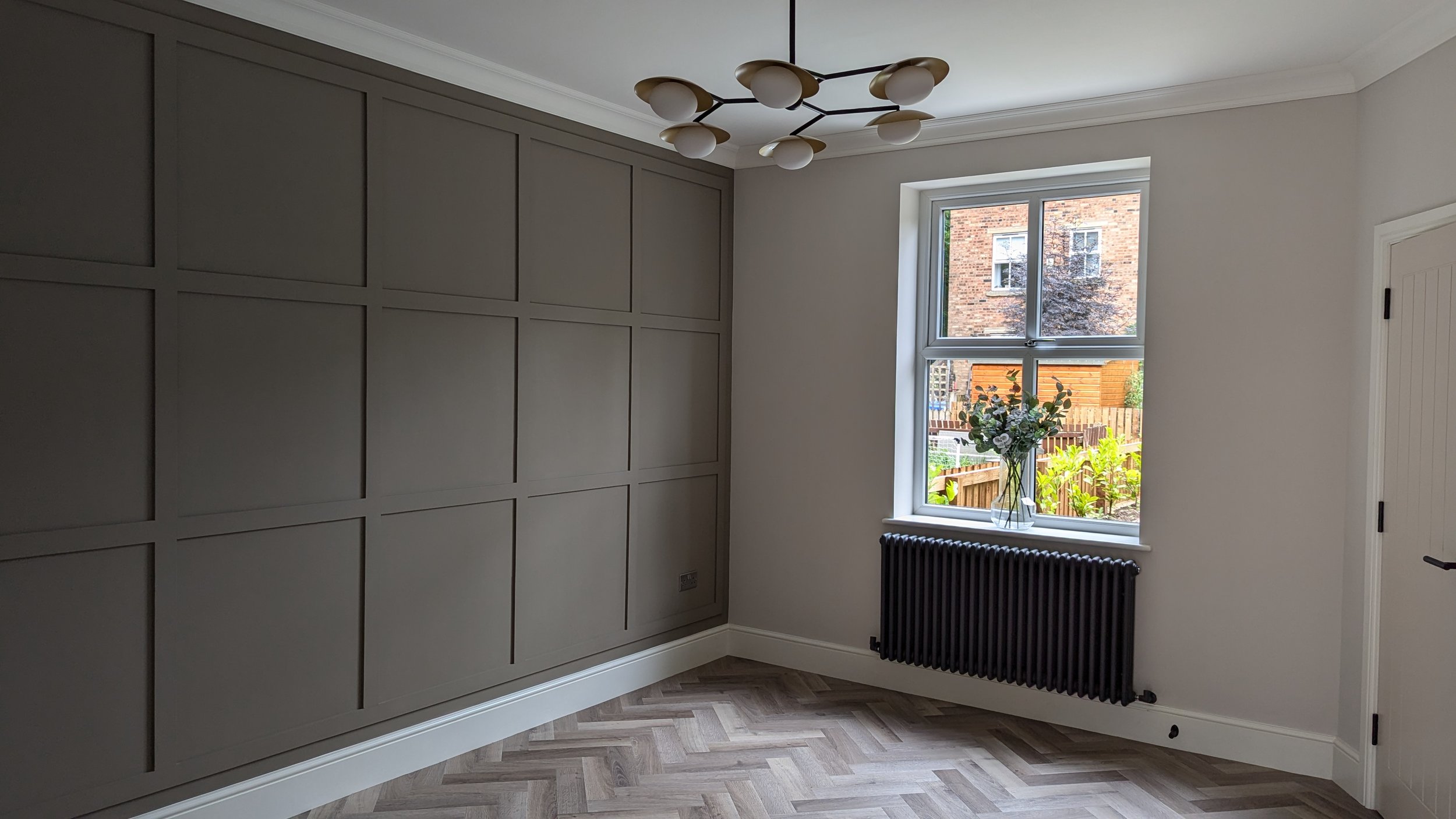
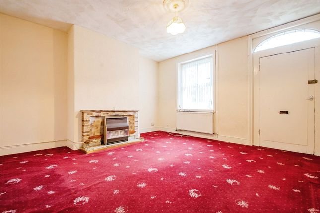
hopefully this one wont be on the market for long - watch this space!
whats new...
the past couple of weeks have been a little different as i’ve been away for a couple of days in Copenhagen (instagram has been in overdrive… how can they be so stylish?!) and i’ve also had a helper with me completing work experience.
it’s a little bit difficult to know what to share and how to host as i can be anywhere on any given day, but that’s the job, so that’s what we did! to be fair it gave a good overview of my role and how a lot of the time its not hugely glamourous! we checked off and distributed products, visited dusty project sites to catch up with contractors, as well as attending some more interesting design meetings.
something we talked about a lot was the importance of clear communication with clients and how listening is a really key part of the job. to put this to the test (keep your fingers crossed folks!) i sent out a small questionaire to be completed and sent back to me before we started our time together.
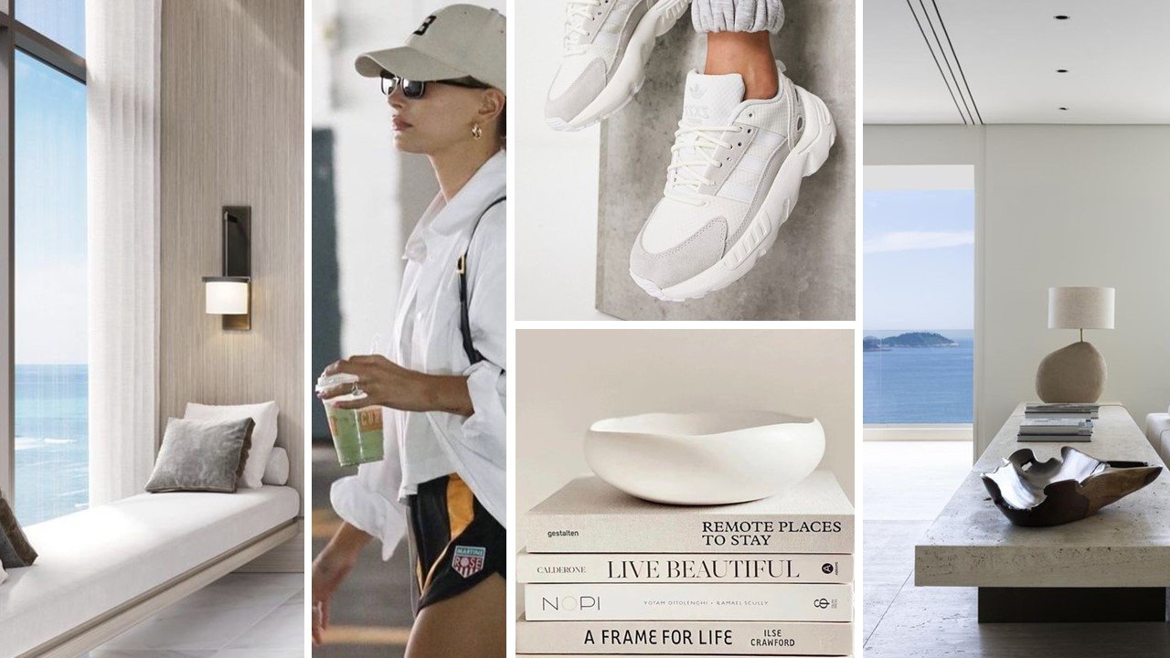
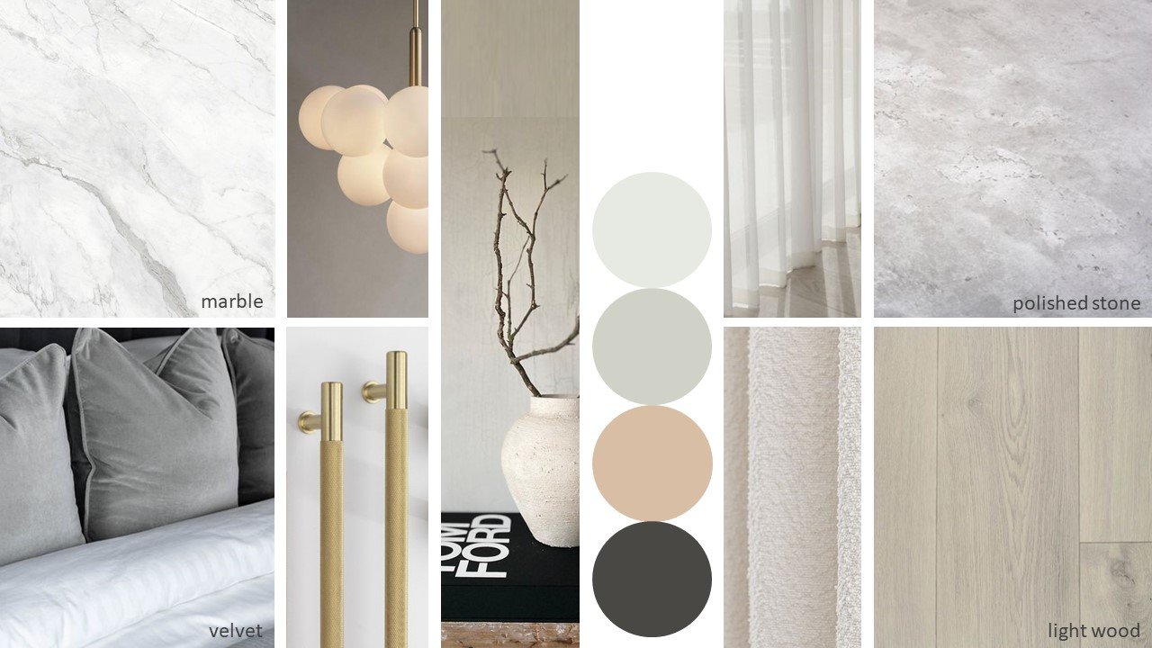
the idea was, that by asking some seemingly random questions, I could produce a moodboard and then a materials board to illustrate their style… did it work..?!
these were the questions with the answers highlighted in bold…
Summer or Winter? Trainers or Heels? Pattern or Plain? Straight or Wavy? Beach or Mountains? Pink or White? City or Countryside? Paint or Wallpaper? Worst Habit? Not drinking enough water
below are the boards i created, what do you think… did i get it right?!
whats new...
the other week i posted a video showing the proposed design and transformation of a clients hallway and landing and so i thought you might like to see the moodboard and product board that have been produced as well.
we wanted a calm, soft and inviting feel where the contemporary elements harmonised with the existing features.
it was important for the original features of the property to stand out and speak for themselves and we wanted to focus on the craftsmanship and ethos of the arts and crafts style so opted for natural, textural materials.
the final details are being confirmed at the moment - narrowing down paint colours, fabrics and furniture choices - all the nice things, so watch this space!
*please note - moodboard images via pinterest and not my own work
whats new...
whats new...
when working on projects, a lot of clients struggle to visualise the final design - mood boards give a great feel for the space and the atmosphere we want to create, but sometimes it is difficult to understand the detail when just looking at a flat two dimensional plan. by using a 3d modelling program i can help the client understand the design and what can be achieved, this helps with decision making and gives confidence in the scheme.
part of the brief for one of the projects i am currently working on is the re-design of the entrance hall, stairs and landing area. the property is a stunning arts and crafts house with some amazing features, but the clients want to update the space with a more contemporary feel without losing the character of the property, especially a beautiful wooden staircase. using the 3d program i was able to share how we could do this - i created the basic video below to illustrate the process.
whats new...
whats new...
i have recently been working on a fun project for a re-design of a teenage ensuite bathroom. the brief was to create something bright, fun and functional, that can transition from teen to adult in the future. after playing around with a few different ideas and inspired by the poster on the concept board below, we decided on a turquoise and green theme, incorporating some terrazzo tiles for a playful feel. a black accent was added with the taps, shower and mirror and the frame that displayed the all important poster!
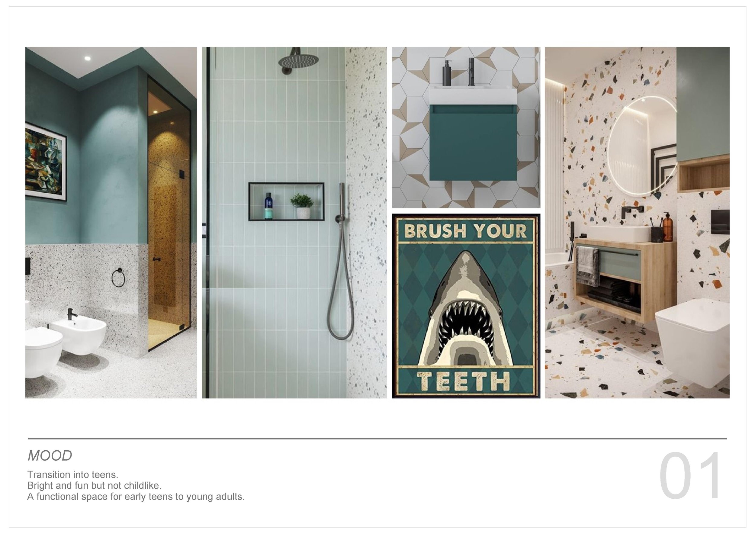
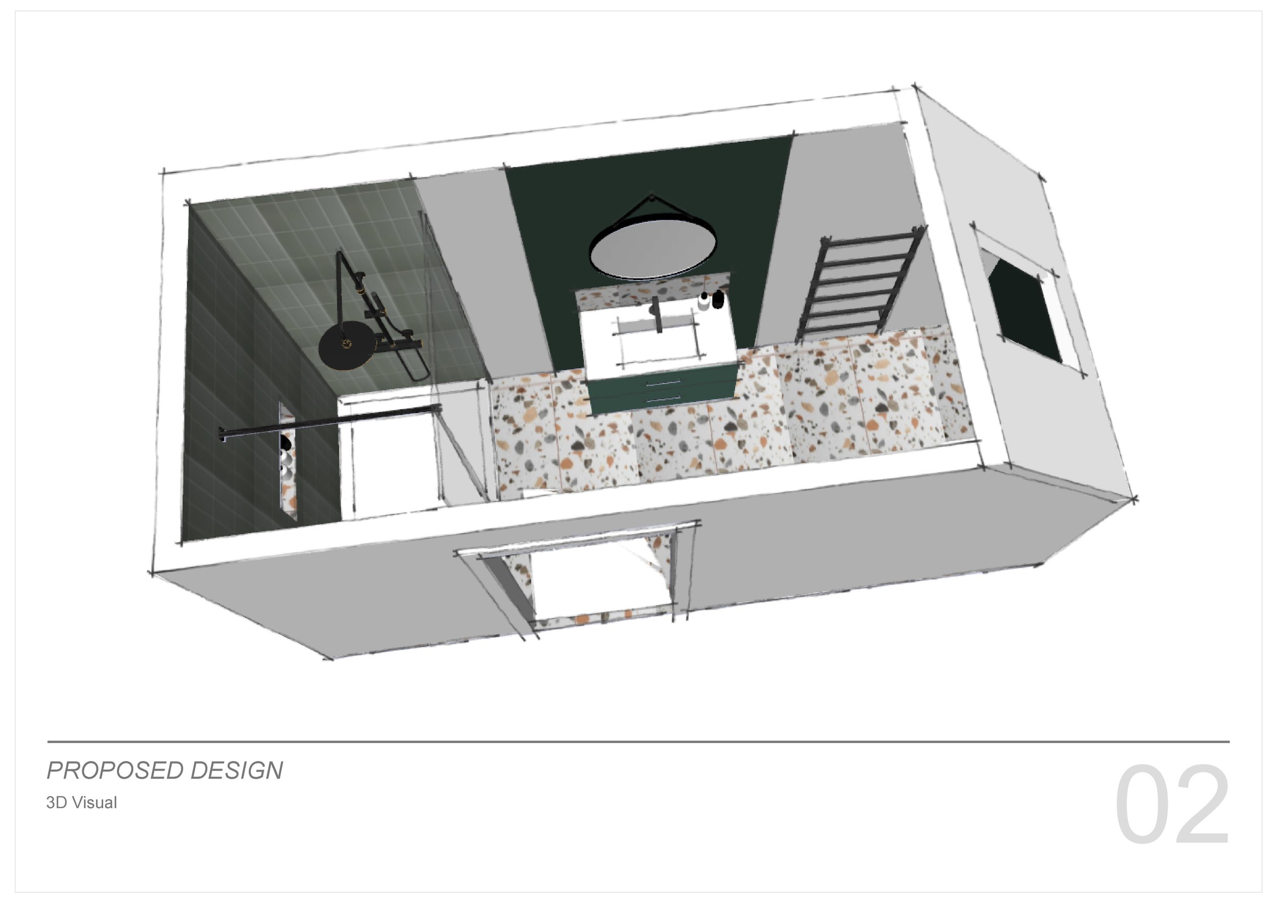
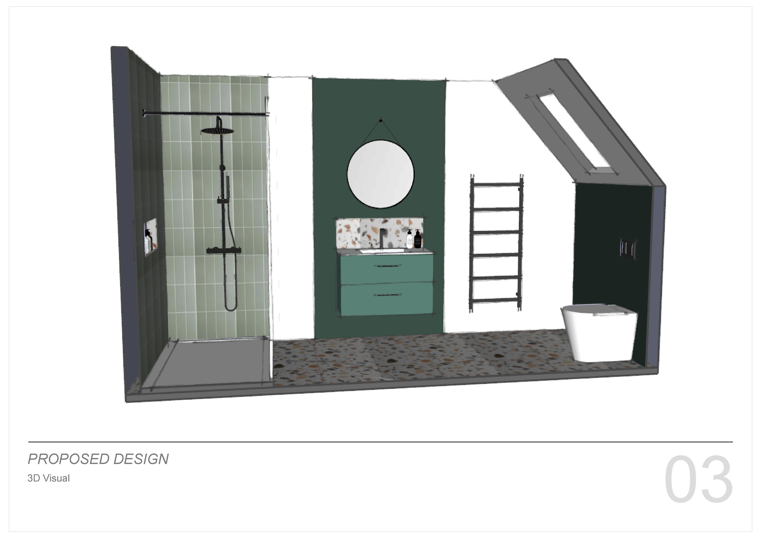
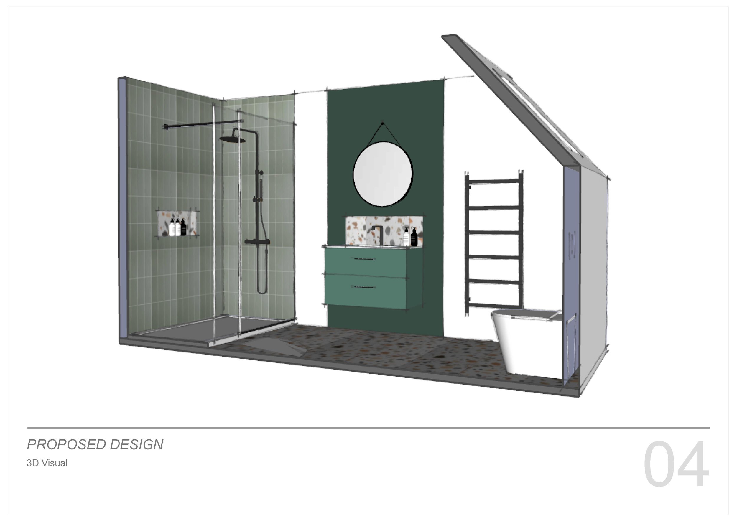
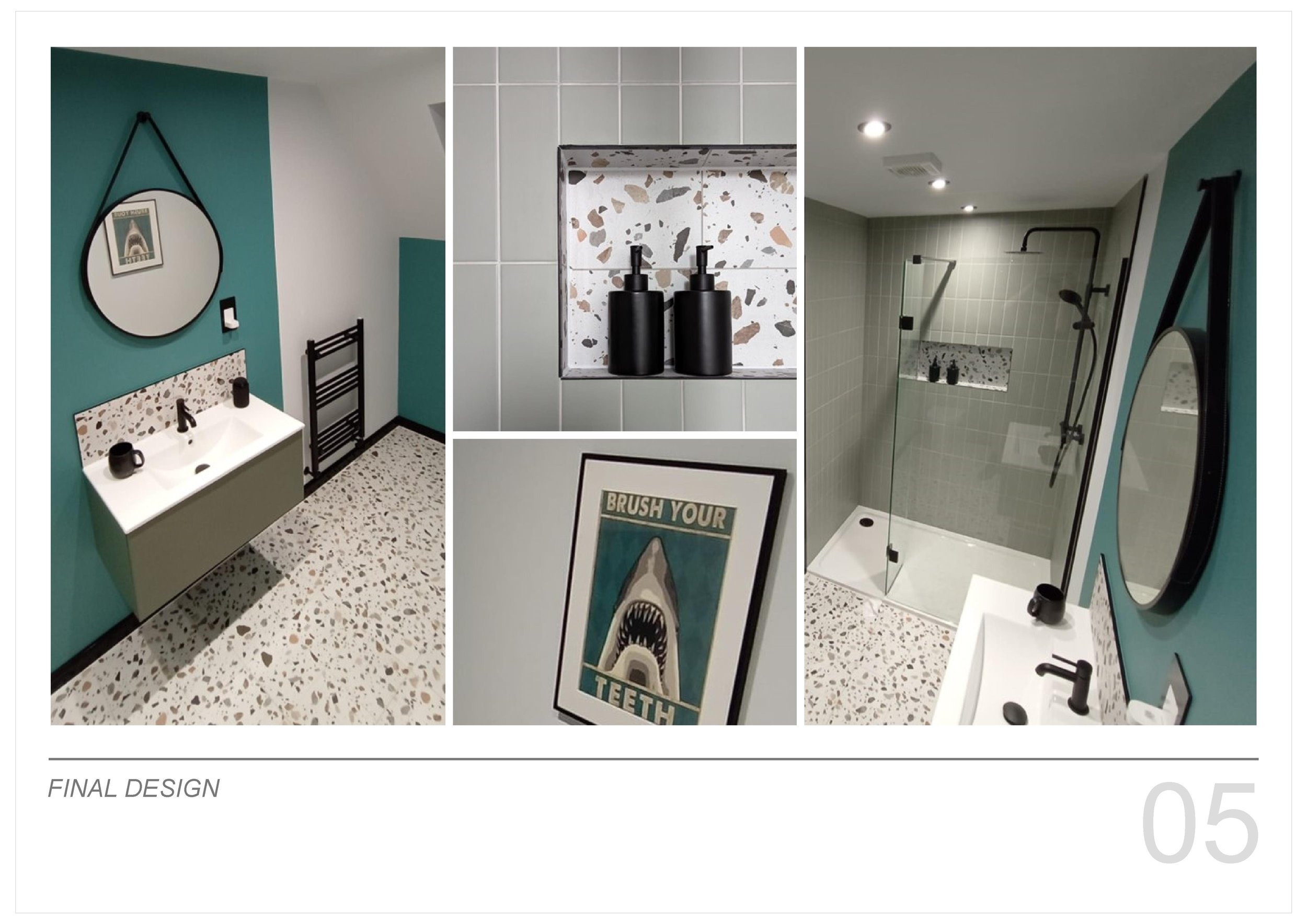
*please note - moodboard images via pinterest and not my own work
whats new...
just back from my travels in thailand (yes, i am in weather shock!) and i thought id share the bits that caught my eye and made me reach for my camera. not the family holiday snaps, but the snippets of inspiration that brought me joy… the colours, people and daily life that make a holiday special… that and the cocktails!
whats new...
whats new...
back to work today after a great week in greece with some of my fav people… but back to reality it is!
lots going on, but one thing that im definitely looking forward to in the next couple of months, is seeing a pilates & yoga studio that I have been working on come to life. the architecture of the space is fantastic - a renovated victorian warehouse - think exposed brick, wooden floors and huge windows providing lots of natural light. the client wanted to create a soft, relaxing and calm environment with natural materials infused with lots of greenery and plants
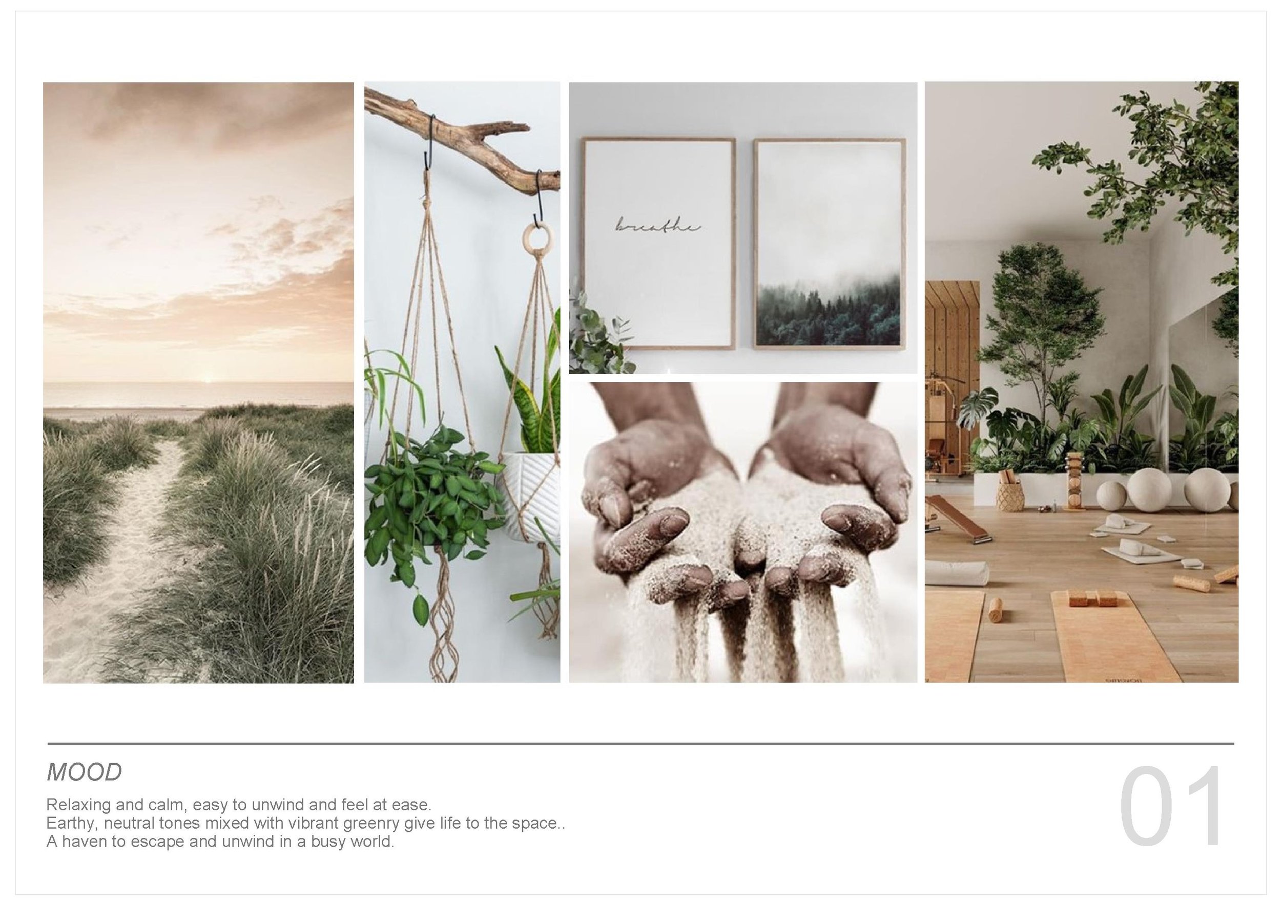
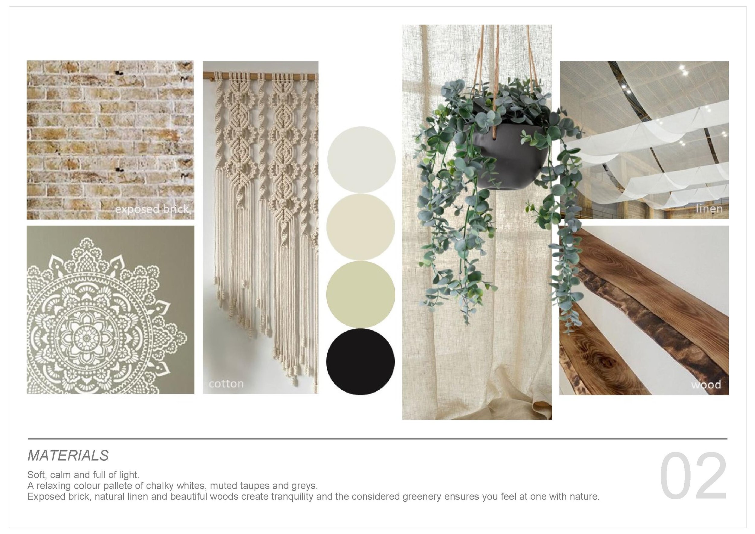
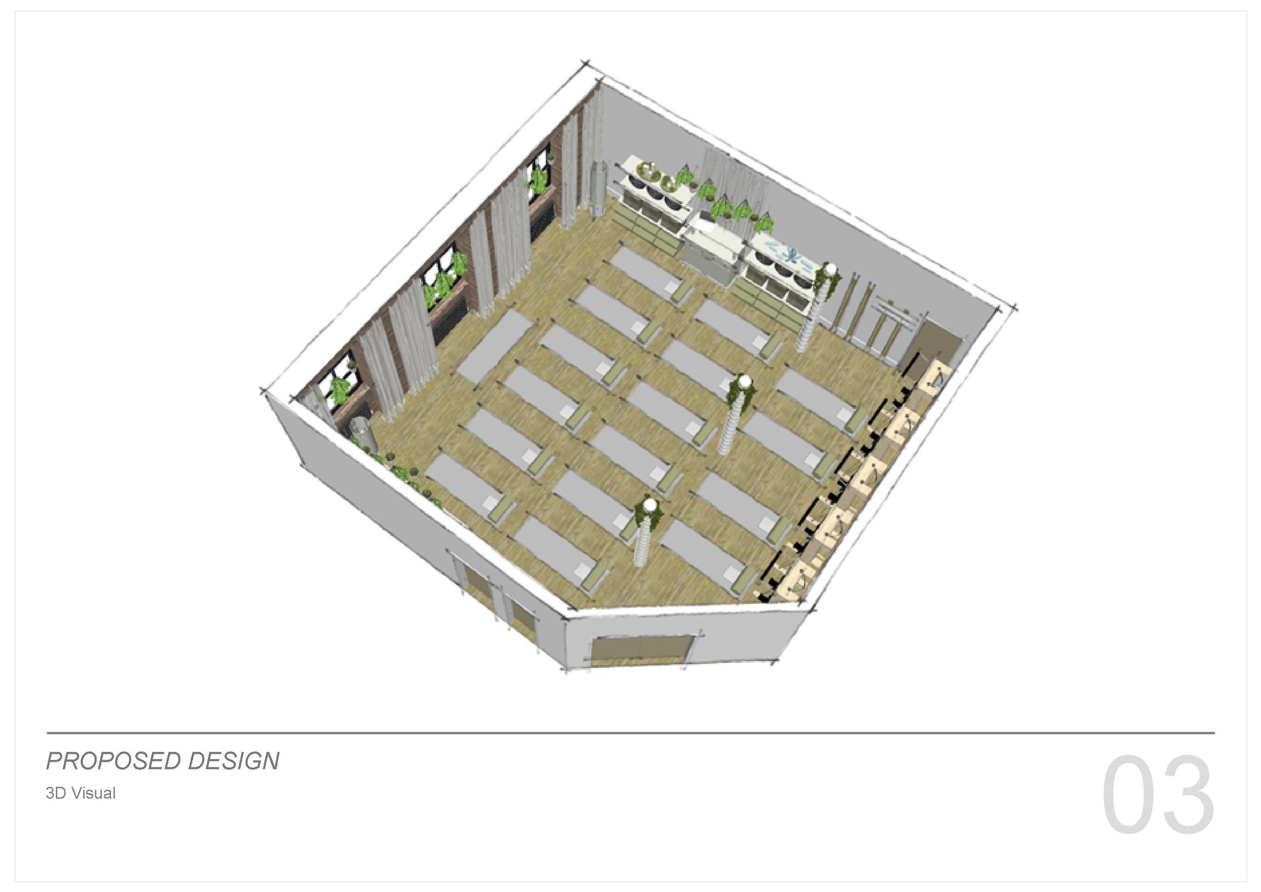
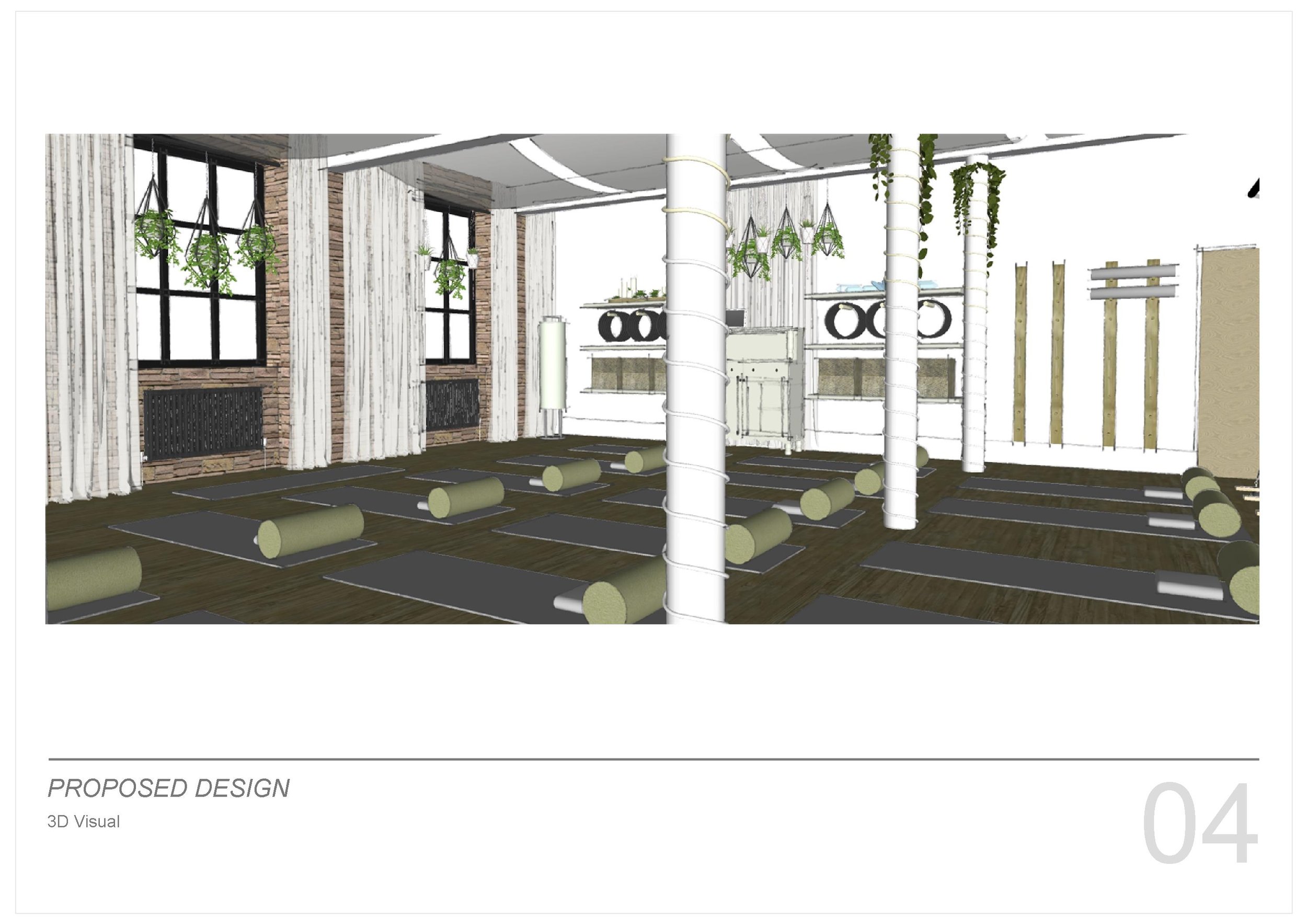
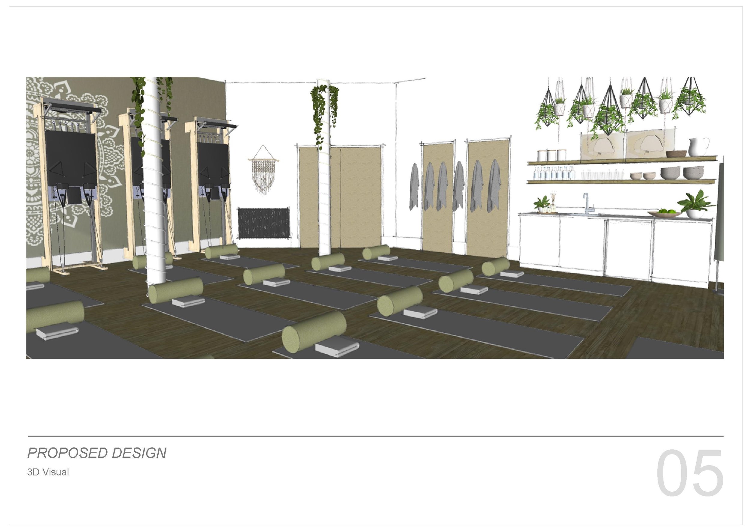
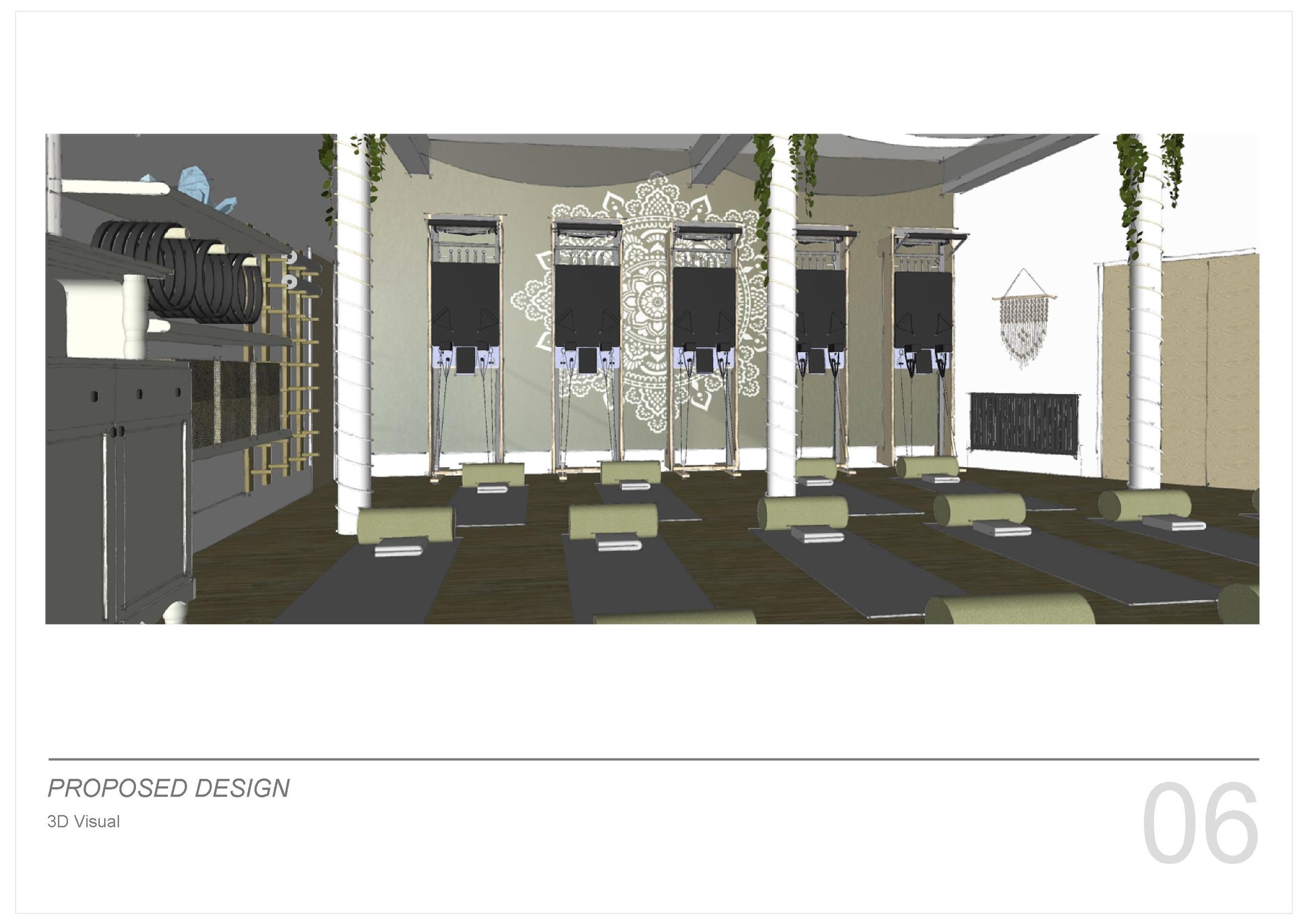
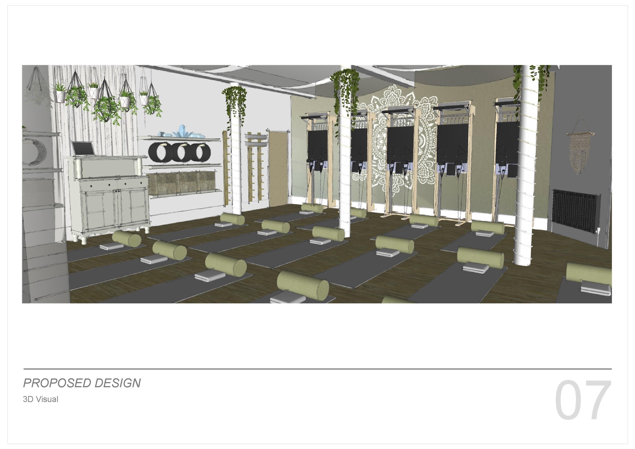
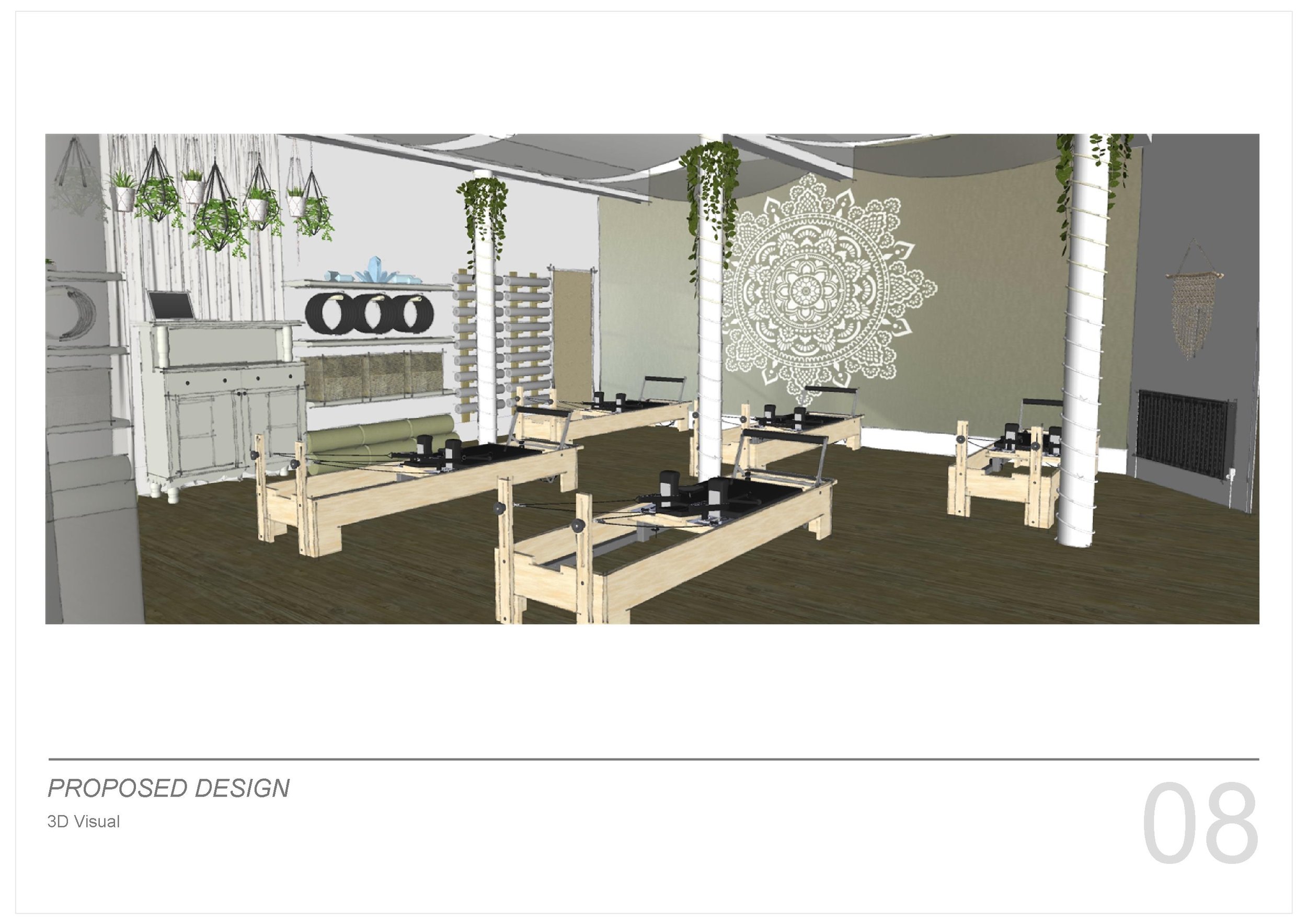
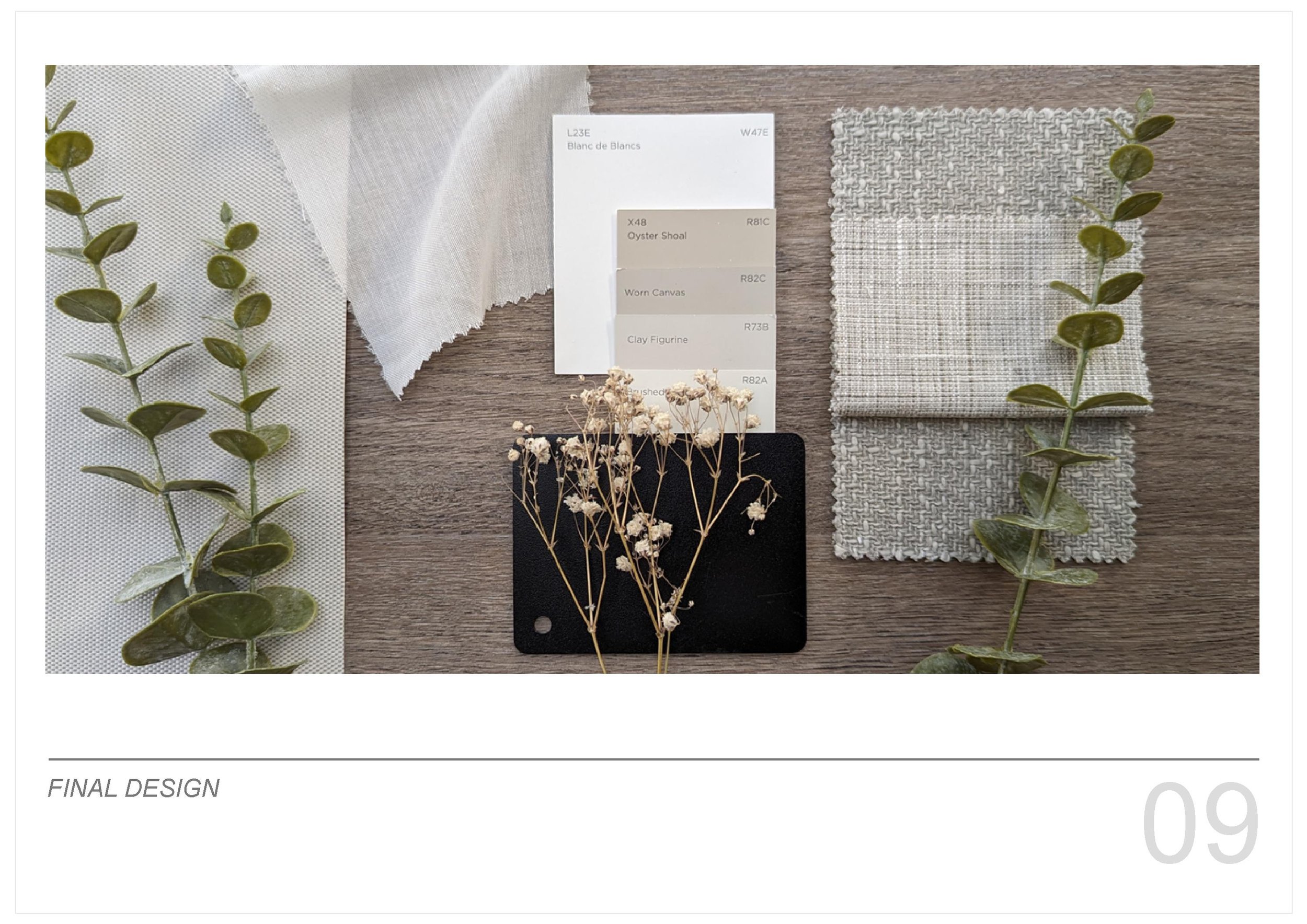
the studio needs to be flexible to accommodate lots of different activities and equipment. the idea is to maximise floor space by utilising every inch of the wall space where possible, yet still retaining a calm and organised atmosphere. the colour palette will be soft whites and neutrals with a pop of contrasting black alongside all the green plants. Natural, sheer fabrics will soften the industrial feel and filter the light from the windows creating beautiful, calm and restful environment.
check out the video below to see the studio come to life.
*please note - moodboard images via pinterest and not my own work.
whats new...
whats new...
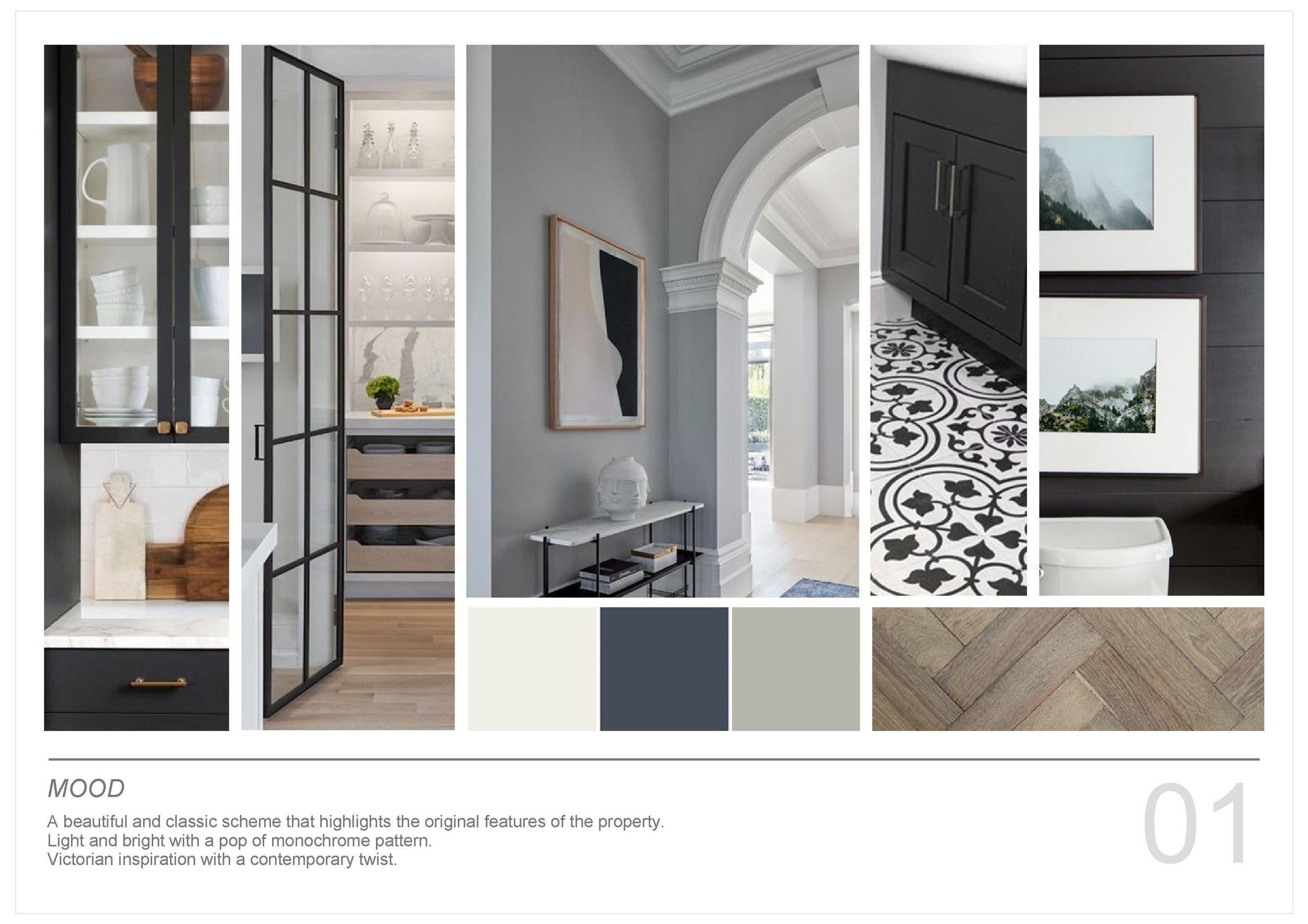
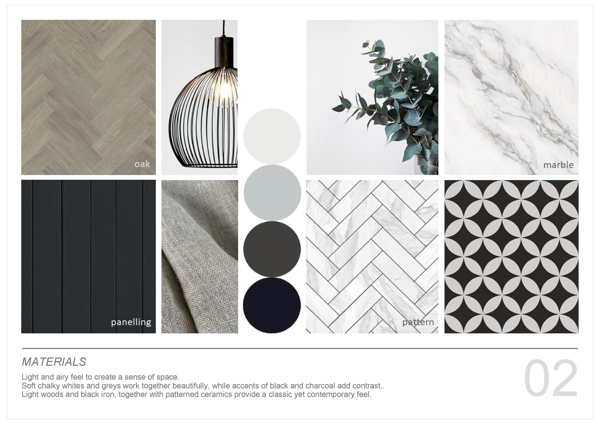
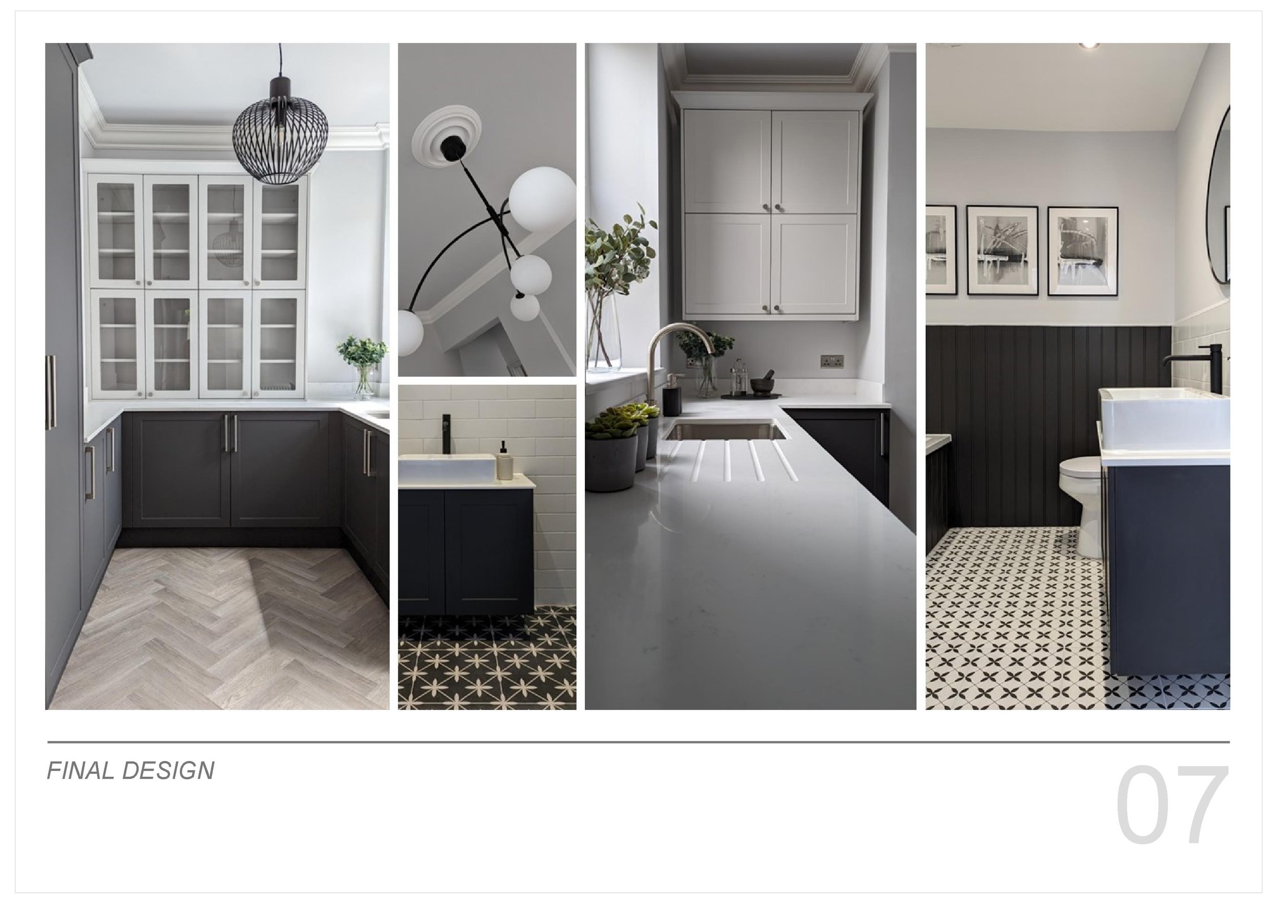
Well once again I've been utterly, utterly useless at writing updates?! Although to be fair, at least it's not a year since my last post! On the plus side I've been super busy, hence the radio silence... Lots of different projects on the go and all at different stages. This week I've been concentrating on finalising and styling one of the property developments that has been in the pipeline. This one has been a goodie, a real transformation... a beautiful Victorian house with some great original features. My favourite part of this property has been the kitchen and the walk in pantry. Check out the moodboards* that I produced to guide us through the process and the final photos.
*please note - all images via pinterest and not my own work.
whats new...
okay, okay… i’ve not manged a post every week (or every month)… but i’m not giving up! it might have been a while since my last post, but i’m still here, working away in the background?!
the house refurb completed AND SOLD QUICKLY WITH A GREAT PROFIT WHICH IS A WINNER. REALLY PLEASED WITH THE WAY IT WAS TRANSFORMED. THE ONLY DOWNSIDE WITH PROJECTS LIKE THIS IS YOU DON’T GET TO SELECT OR INSTALL ANY FURNITURE OR SOFT FURNISHINGS, AS THAT IS DOWN TO THE BUYER!
I’VE ATTACHED THE ORIGINAL MOODBOARD first* aND SOME PICS OF THE FINISHED ARTICLE, CAN YOU SEE THE LINK?!
*please note - all images via pinterest and not my own work.
whats new...
last week i was focusing on bathroom products, this week its tiles! there are so many different styles to chose from… big, small, patterned, plain, shiny, matt… the list goes on..?!
once again, i turn to the internet (what did we ever do without it?!) for inspiration, look at different options and get ideas. they need to have a natural feel, with a soft colour that works well with the white bathroom furniture. neutral but not boring, i think matt not glossy and it would be great to get some texture. let the hunt commence…
top left to right - european heritage, porcelain superstore, mandarin stone, bert and may. bottom left to right - porcelain superstore, bert and may, porcelain superstore, victorian plumbing
some beauties eh?! decisions, decisions…
whats new...
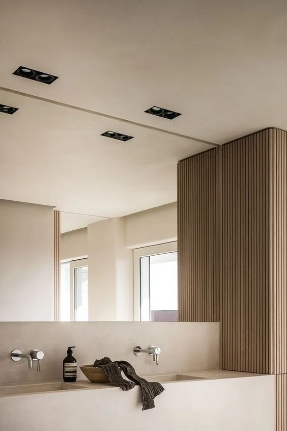
so, we have decided on the general feel for the house renovation! final moodboard below. it is soft and calm, using natural materials combined with a hint of black for contrast and a modern edge.
now we have this as a guide, I have been looking at bathroom inspiration… its soooo easy to lose a couple of hours on pinterest?! the bathrooms below tick all the boxes for this project… so using these as inspiration, in conjunction with the finalised layouts, i can now start to narrow down specific products and finishes. this will allow the first plumbing fix to go smoothly… next stop, tiles!
*please note - all images via pinterest and not my own work.
whats new...
following on from last weeks property development moodboards and linking in with the post form a couple of weeks ago, i thought id share how sketchup can really help when trying to visualise potential changes.
the property that i am currently working on featured in the previous post, had a bit of a disjointed layout on the ground floor which made the space feel much smaller and tighter than it could be. the kitchen was located at the rear of the property through a tight door, making it feel disjointed from the rest of the ground floor and a little awkward.
i produced a basic sketchup video to show what could be done to help open up the space and make it feel lighter, brighter and more connected with a better flow.
removing the chimney breast in the back room of the house would automatically make the space feel much bigger and to make the kitchen feel more connected, i looked at widening the opening between the back room and the kitchen extension as much as possible. removing the stair wall and proposing glass balustrades, makes everything feel more open and connected.
before and after - looking from the kitchen into the living area
before and after - looking from the living area into the kitchen
the structural building work is now complete and it really has made a difference, there’s still lots to be done, but its great to see such a transformation!
whats new...
so, what have i been up to this week… well, amongst various site meetings, client visits and hours of product research, I have been creating mood/concept boards for a new property development project i am working on… the site is being stripped as we speak!
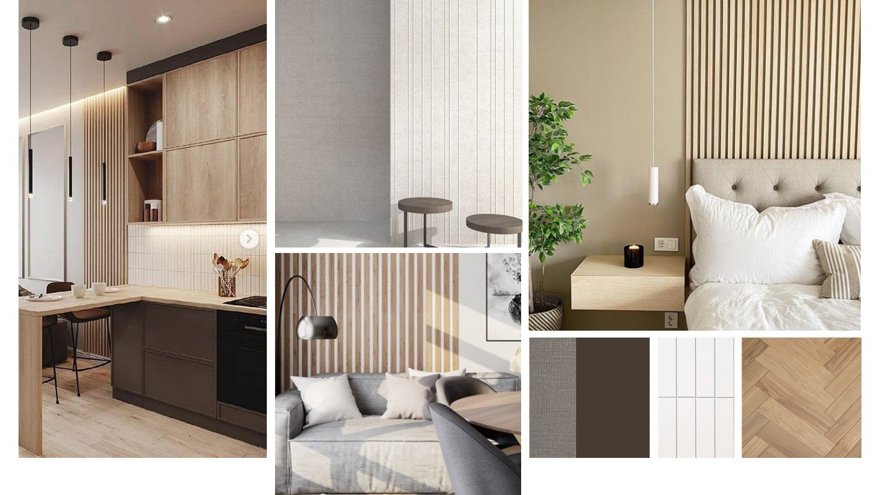
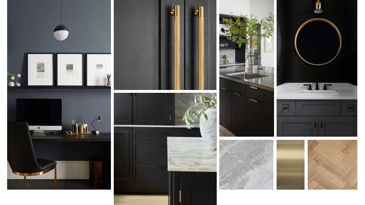
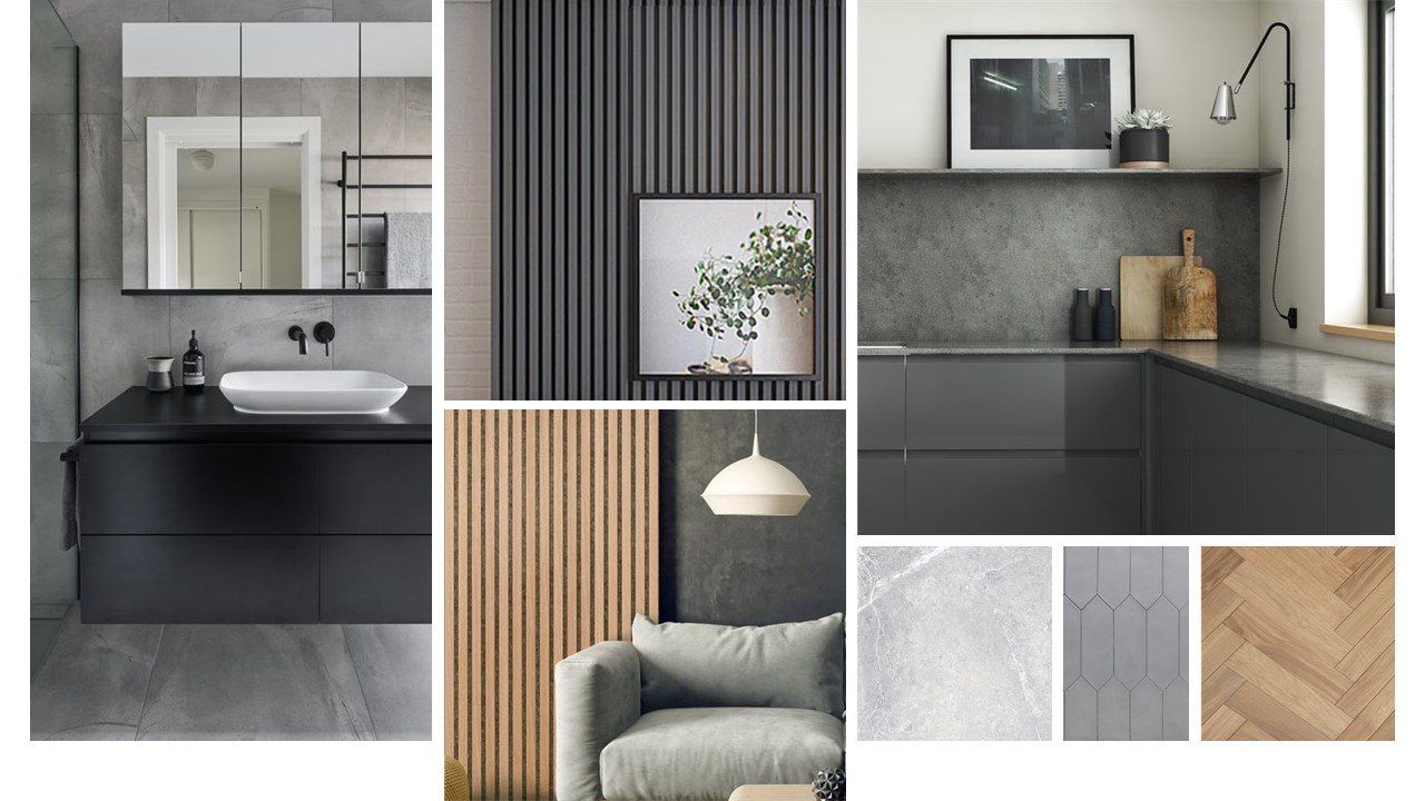
i have pulled together various different looks to talk through with the client at the next meeting. the property is a semi detached house and needs a complete refurb. we want it to feel clean and modern, allowing potential buyers to see the how they can make it their own. it needs to be welcoming and functional and also have a bit of wow factor that makes it stand out from other properties on the market.
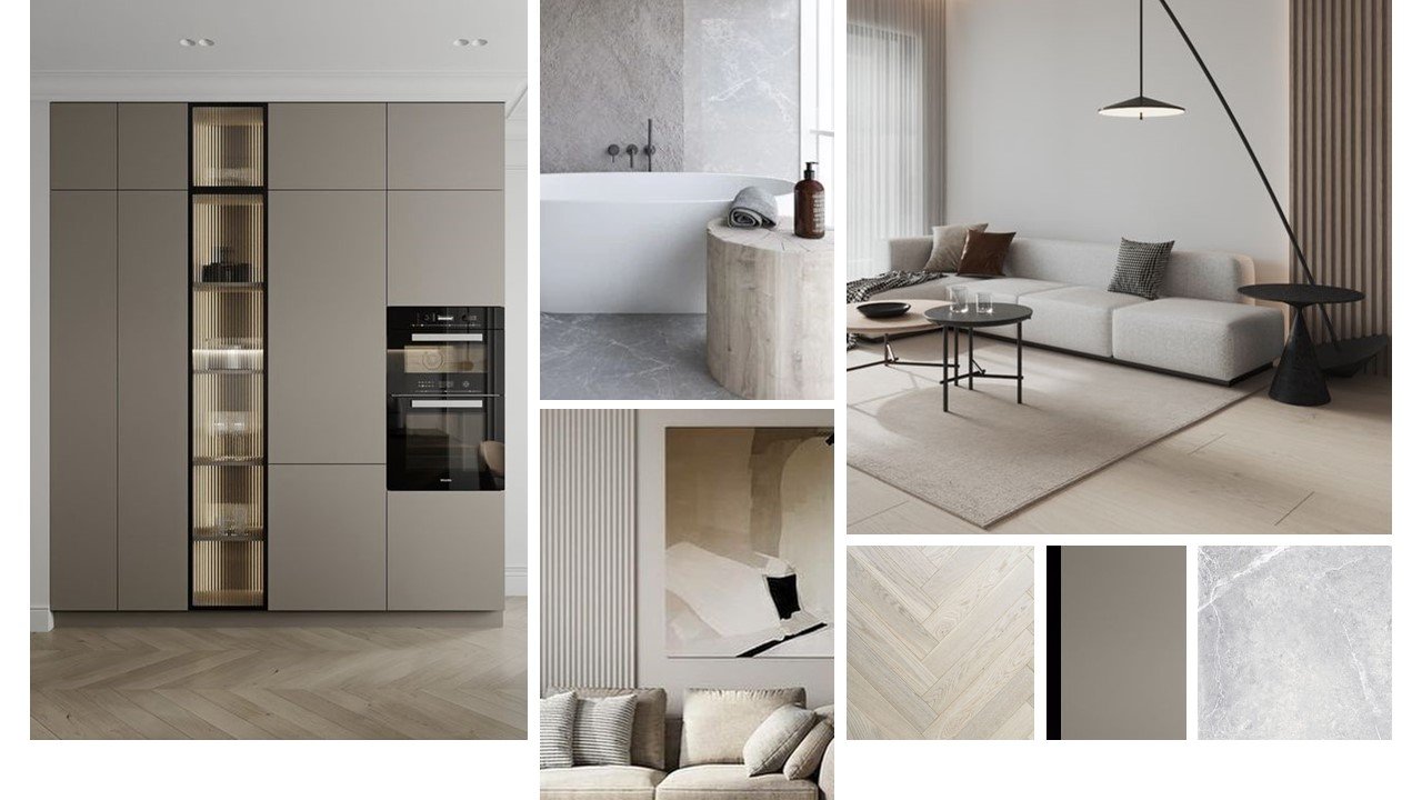
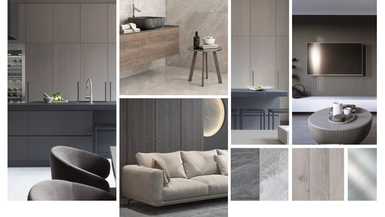
*please note - all images via pinterest and not my own work.
i actually like them all and feel that anyone of them could work. we have done something similar to option three before, so it would be nice to do something different - that said, both of those properties sold before they even went on the market, so maybe if it isn’t broken then don’t fix it?! then again, a change is as good as a rest…decisions, decisions, watch this space!
whats new...
a huge part of any successful space/room is getting the layout right. of course it is very important to ensure the room is visually balanced, not cluttered and has focal points, but more importantly it needs to be functionally correct and easy to use. it’s all well and good having a beautiful living space, but if you cant pull out dining chairs, open drawers, or flow round the room because the space is too tight, it soon becomes annoying and makes day to day life very difficult!
working to achieve the best layout is one of my favourite parts of the job, it’s a bit like a puzzle… frustrating at times, but once you get it right its very rewarding! i usually work in 2d (plan view) to begin with, either drawing by hand or using a computer program such as autocad or sketchup to help. it basically involves moving scaled shapes around a plan of the room and using ergonomic and functional guidelines until you get the right solution!
once i have a good layout, i use sketchup to turn it into 3d. i have found that using this as a tool is really helpful and allows the client visualise the solution and see the potential of the space. it also helps show them when things wont necessarily work in a good way?!
one project that i am working on currently, is a beautiful three story victorian semi detached house. the clients want to open up the rear of the property with an extension and re-model the ground and first floors. the first thing we looked at was a mood board for the general feel of the space, ensuring we had a clear style direction. i really do love the overall feel…
*please note - all images via pinterest and not my own work.
once we had done this, the next step was to explore lots of different options for the layout and how they could achieve their dream home in the best possible way. we started by discussing the main things they wanted to include and how they wanted to use the space and live day to day. this then gave me lots of information and detail and allowed me to produce a number of different solutions to discuss.
at this stage i tend to create my 3d visuals in white with no colour or textures and keep them quite basic. I do this purposely so that the client focuses on the layout and that they don’t get too hung up on colours or specific types of furniture. the idea is to show how the space can potentially feel and whether it will work for them functionally day to day.
once happy with the layout, we can then start to build on the visuals, adding more specific furniture, colour, texture and light. if extremely detailed computer generated images are required for the project, i will outsource to a cgi company who will produce - this is a whole different skill set and can be very time consuming… i leave that to the cgi specialists!
whats new...
i’m extremely lucky that my job allows me to work on many types of project - small, large, commercial, residential… there’s always something different to keep the creative juices flowing!
one of my current projects is a an amazing residential property that the client is building from scratch, allowing us to really push the boundaries, no more so than in the basement bar-nightclub-cinema room… I know, so jealous!
the brief was to create a great space for entertaining and partying with friends, that could also double as a cinema room when needed. it had to feel atmospheric and incorporate seating, a bar, cinema screen and dancefloor.
our final feel for the space was… dark, blue and fun!
*please note - all images via pinterest and not my own work.
the basement location is rectangular with no windows and we wanted to soften the linear/flat feel. to do this we added a curved dancefloor and bar, which help to make the room feel wider and more interesting. the bespoke wall shelves and banquette seating also have a curved design, which tie the whole look together.
to create a dramatic feel, the two main walls are lined with velvet curtains with mood lighting integrated in the pelmets. by painting the ceiling blue to match the walls we will create a dark, moody basement jazz bar feel. the finishing touches, a large gold disco ball and a bespoke neon wall sign, add the fun party feel!
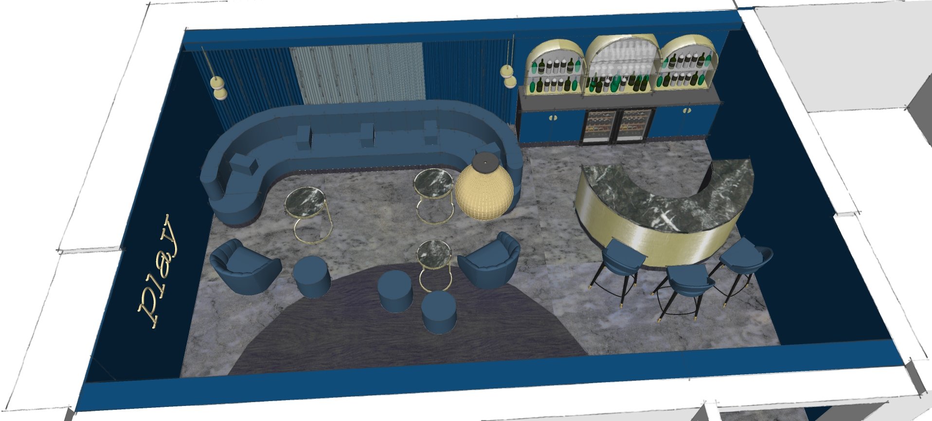
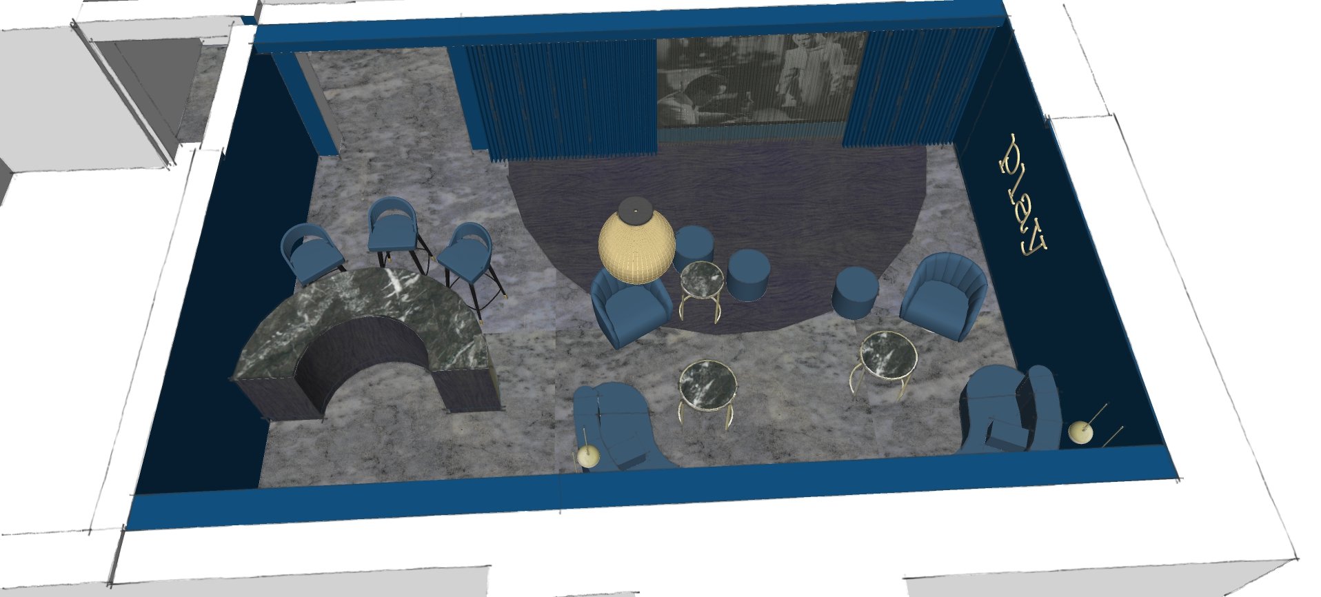
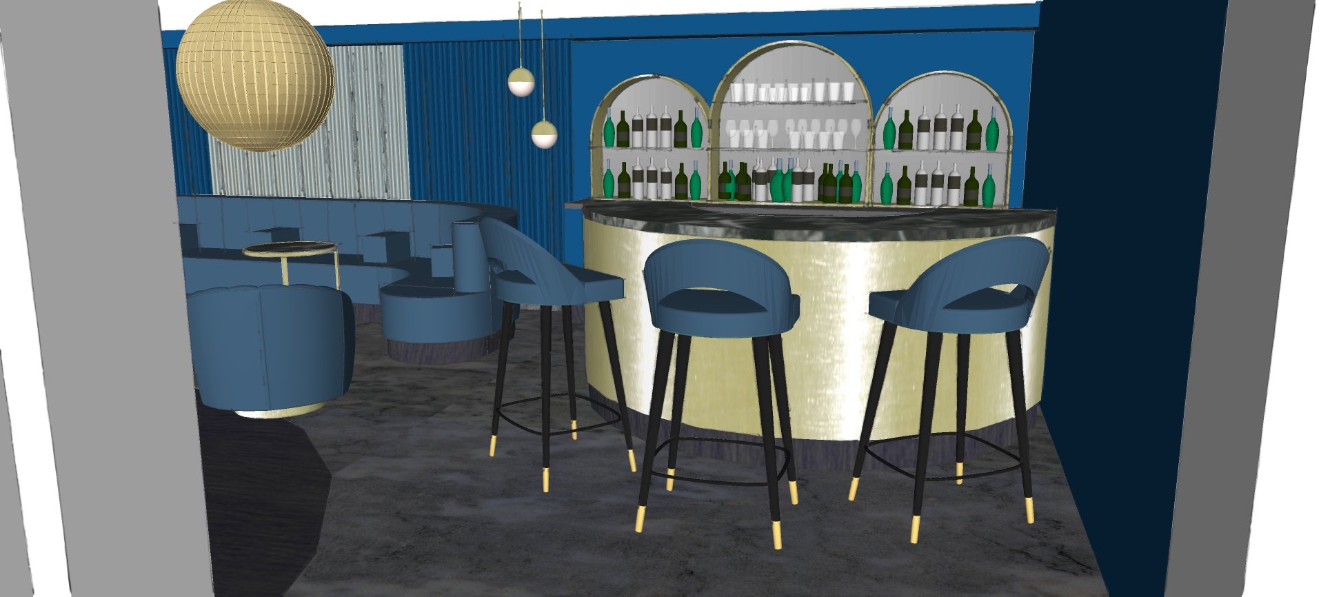
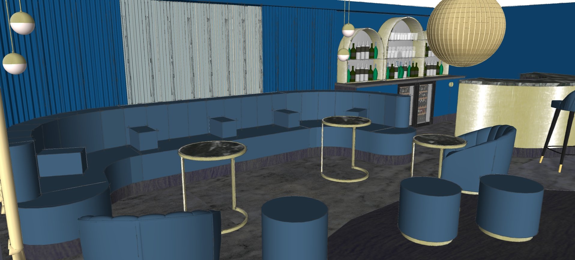
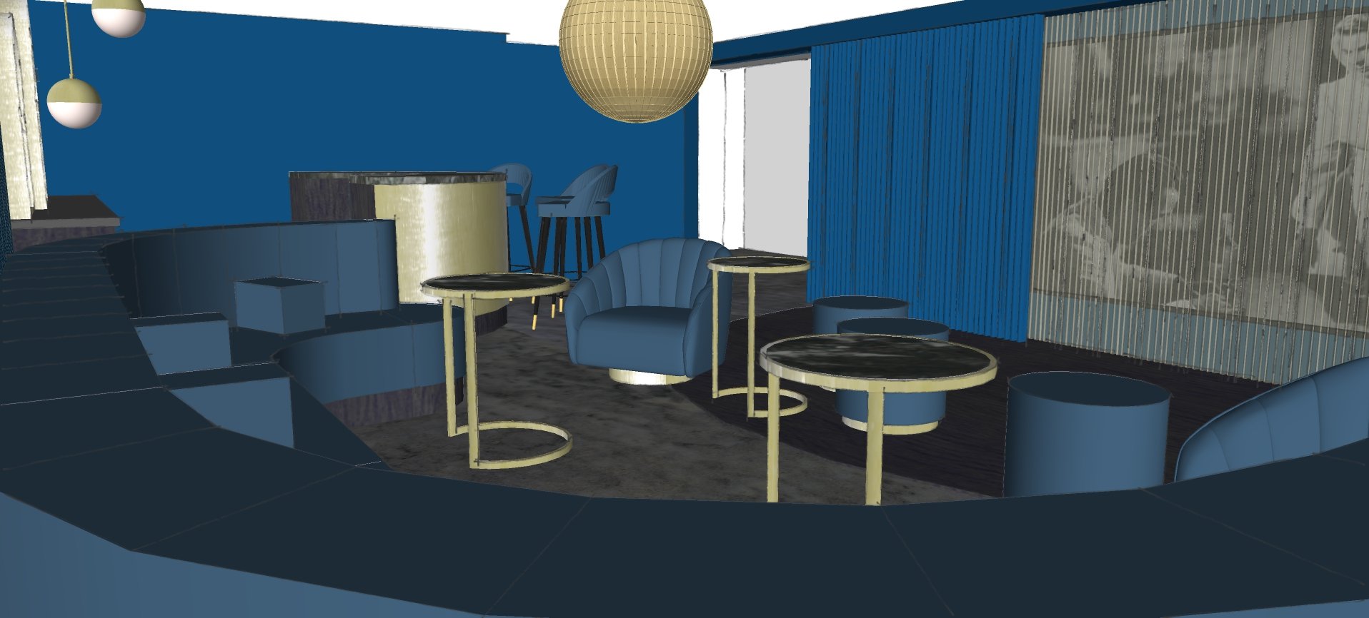
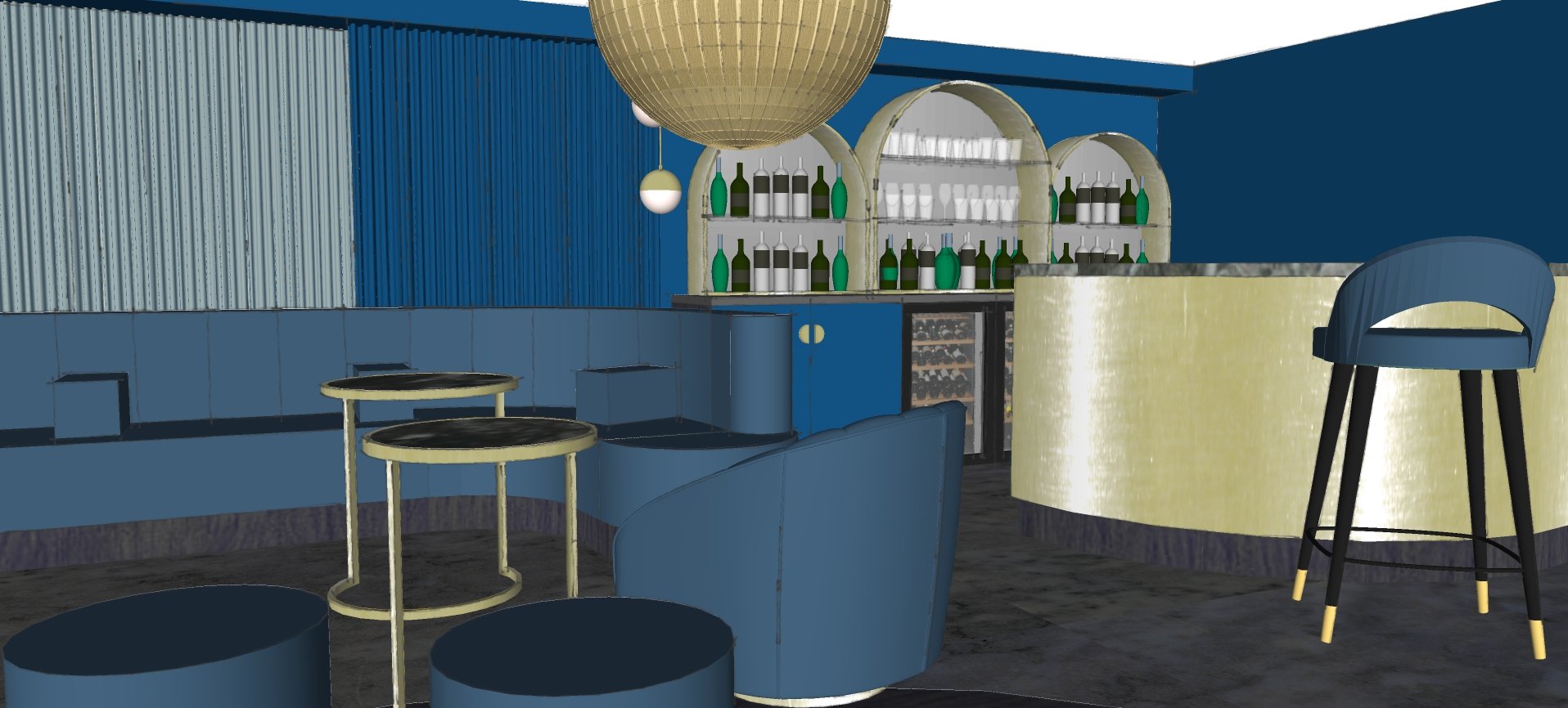
the install is well and truly underway as we speak, which is VERY exciting! dancefloor and bar have been fitted, all electrics first fixed and the furniture is in production… not long now… watch this space!


