whats new...

happy new year and welcome 2022!

new year, time to set new goals and get organisedโ€ฆ for the last couple of years i have been procrastinating about updating my website and being more consistent with posts and contentโ€ฆ one look at the date on the last post below, confirms i havenโ€™t been very successful?!

that said, thereโ€™s no time like the present, so iโ€™m backโ€ฆ for at least one post, with fresh intentions to share more inspiration, more projects and generally have more of a presenceโ€ฆ lets see how we go?!

the last couple of years have been different to say the least?! and difficult for many people. personally it has brought ups and downs, but professionally the last couple of years have been kind and iโ€™ve never been as busy. iโ€™ve been very lucky to be able to work continuously and on a wide variety of projects, small and large, residential and commercial.

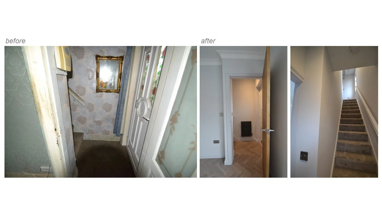
a really satisfying project that competed recently, was the renovation of two houses for a property developer i work with on a regular basis. originally two houses when built, the previous owner had knocked them into one and when we started the project, they were in need of some real tlc.

the decision was made to re-configure the layout and turn one house back in to two. we wanted to create contemporary, comfortable living that was flexible for a variety of potential buyers. it was especially important to get the kitchen and bathroom areas right and where possible create a feeling of luxury and space.

we transformed the bathrooms by increasing the size slightly which enabled us to include a free standing bath as well as a separate shower enclosure. downstairs we opened up the kitchen and living areas, but added sliding pocket doors that allowed privacy when needed. the overall feel was modern and calm and we kept the colours and finishes neutral, to create a blank canvas for the new owners.

check out some of the pictures, from before and afterโ€ฆ

Embed Block
Add an embed URL or code. Learn more

the wanderer returns!

well, itโ€™s a new year and a good time to get back on it. posts were few and far between towards the end of last year โ€“ poor, very poor I knowโ€ฆ must try harder?! on the plus side, the lack of posts was due to lots of work, so no complaints! for most of 2017 I was working hard on a large residential project, from the initial designs and ideas, right through to the implementation and styling โ€“ really exciting and rewarding to be part of the process from the very start to the finishing touches. a few sneaky peaks below, more photos to follow shortlyโ€ฆ

so, what will 2018 bring..?  well, iโ€™ve just embarked on another exciting project - a holiday let right on the waterside, so as usual the researching and inspiration gathering has commenced in earnest and Iโ€™ve been busy creating moodboards and squirreling information galore! the feel for this property is calm, airy and relaxed. modern and stylish, with a comfortable, luxurious edge. the palette is neutral to keep the calm vibe and appeal to a wide audience, and is warmed with touches of wood. check out the moodboards below.

*please note - all images via pinterest and not my own work.

Seaclusion Final Moodboard First-page-001.jpg
Seaclusion Final Moodboard Ground-page-001.jpg

As for the rest of the year, who knows? hopefully it will be filled with exciting and inspiring projects that keep me busy and out of trouble, watch this space! I hope that 2018 will be all you all wish for too. until next time :)

start as we mean to go on!

what a great way to start the new year! just received some lovely feedback from a project i completed at the end of last year.

โ€œWe have previously tried to produce our own office layouts but we have now found this to be a false economy, Kate made the whole process simple and pain free. From our initial meeting a number of options were produced for us to comment on and then the final scheme with costings was developed with a full visuals pack. The equipment schedule made procurement easy and we are delighted with the results โ€“ it has given the whole staff a big lift at a cost that did not blow the budgetโ€
— Adrian Lucas - Director, J&J Engineering

due to continued growth and expansion, j&j fire engineering, based locally in lancashire, needed some support updating their offices to accommodate the increased number of employees.

the office building itself has some beautiful original features and where possible these were left untouched. to help the space feel larger and more open, existing internal walls were removed and lots of high, closed storage was introduced to hide away files and other day to day items. work areas were clearly zoned and the furniture and fittings kept light in colour to help reflect the light. colours were kept simple and in keeping with the company's branding. large scale photographs of industrial engineering parts will adorn the walls and to add a quirky touch, the coat rail as you enter is created using sprinkler pipes and valves. 

to help the client visualise the new space, moodboards, cad plans and sketchup visuals were provided and a complete costing and product breakdown helped the client move forward quickly with purchasing. watch this space for photos of the completed project once all the finishing touches are in place!

doorstep delights!

whilst being up north and working from home for a while, i'm trying to make the most of local galleries and exhibitions while i get the chance. i've visited quite a few in manchester and fab they have been too, but closer to home and more or less on my doorstep (give or take a few hundred houses) there's lots on offer... i just need to open my eyes!

accompanied by my pops, i embarked on a day of culture in good old bury. now i've been on the lovely steam train and pleasantly trundled up and down the lines before, but i was only vaguely aware that there was a transport museum across the road?! and what a great little find. i'll be honest i wasn't expecting to get that inspired by trains, (i'd like to say planes but it's not that big) and automobiles, but you know what, i managed to take a fair few piccies, so i guess i was! from vibrant, polished colours and shiny badges, to cogs, wheels and more vintage signage than you can shake a stick at, i loved it!

whilst we're on the doorstep, i was to be shamed further by the father when asked how long it had been since i'd ventured into bury art gallery... not that long... five... six... it can't be ten years..?! and i'm supposed to support the local arts... i think not. so, off we went for an explore and once again i was more than pleasantly surprised! a fantastic building with beautiful original features - the parquet floor is to die for! and thereโ€™s a varied selection of paintings, traditional and modern, definitely something for everyone. 

i was giddy to find that one of the paintings i remember from prior visits was still there - an amazing oil on canvas by mark le Claire. every time i see it childhood memories are conjured up (i loved my parka, until i caught my chin in the zip!) but iโ€™m still always convinced it's a photograph and not a painting!

the cherry on top is that there are also some really interesting exhibitions with lots more, you guessed it... great photo opportunities.! #photogeek 

turning japanese...

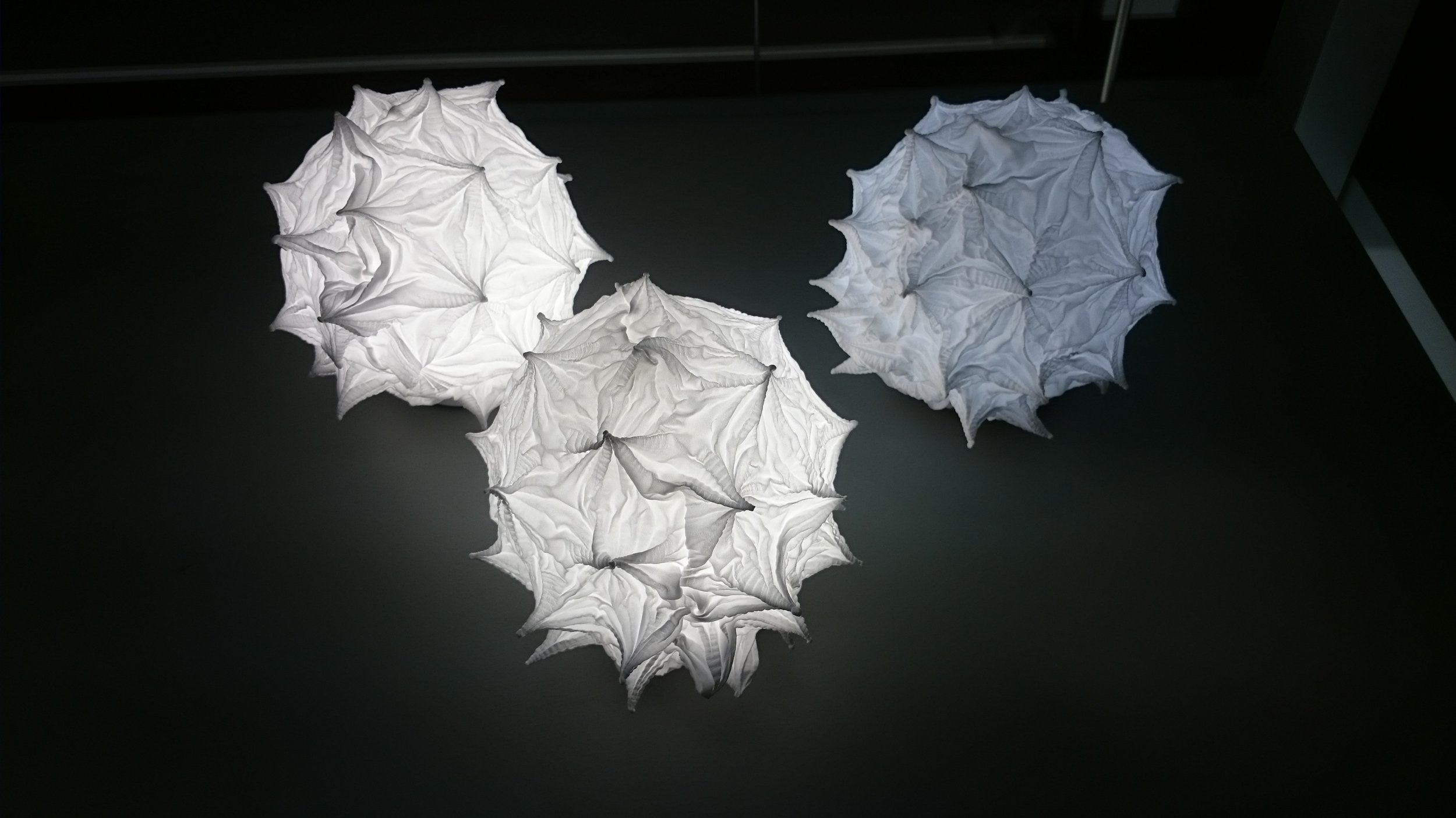
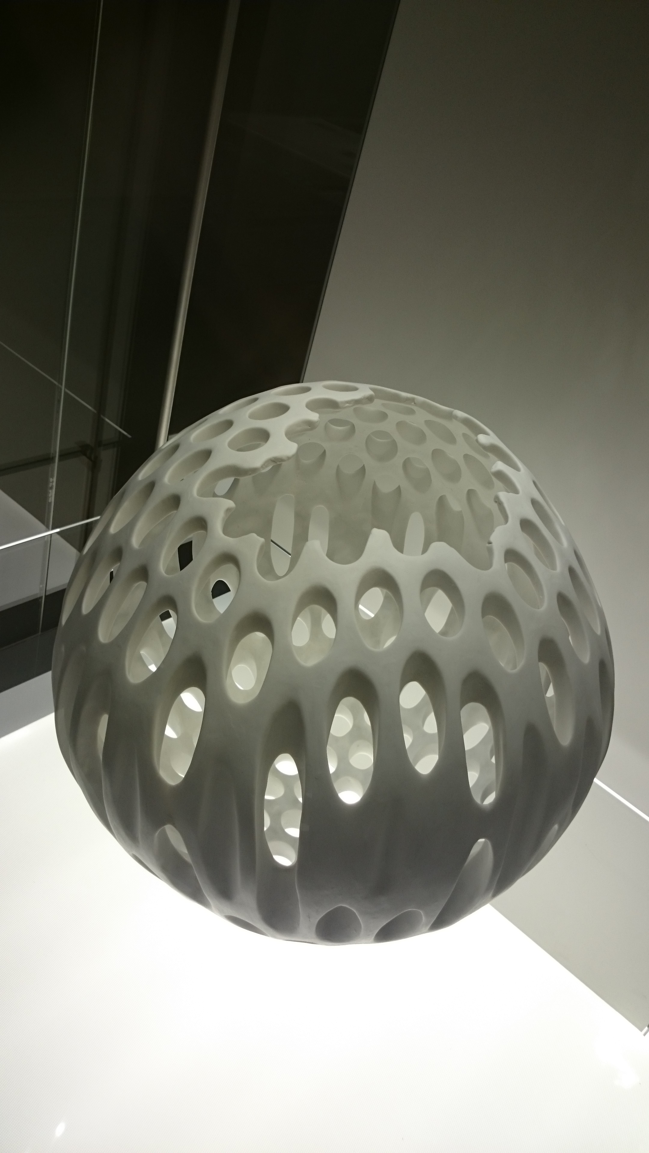
the other week i posted about the fab fashion exhibitions i saw at manchester art gallery, full of colour, glitz, glamour, sequins and lots of lace! well, the same day, in the same building, i also visited an exhibition about modern japanese design and it was probably the most calming, sedate exhibition i've ever been to - two total contrasts, each amazing in their own way. the japanese exhibition featured furniture, fashion and many accessories from vases and lighting, to pots and jewellery. it was truly beautiful - there's something incredibly calming about japanese design... the sculptural nature of many of the pieces is stunning and i continue to be amazed at the craftsmanship and origami style designs...

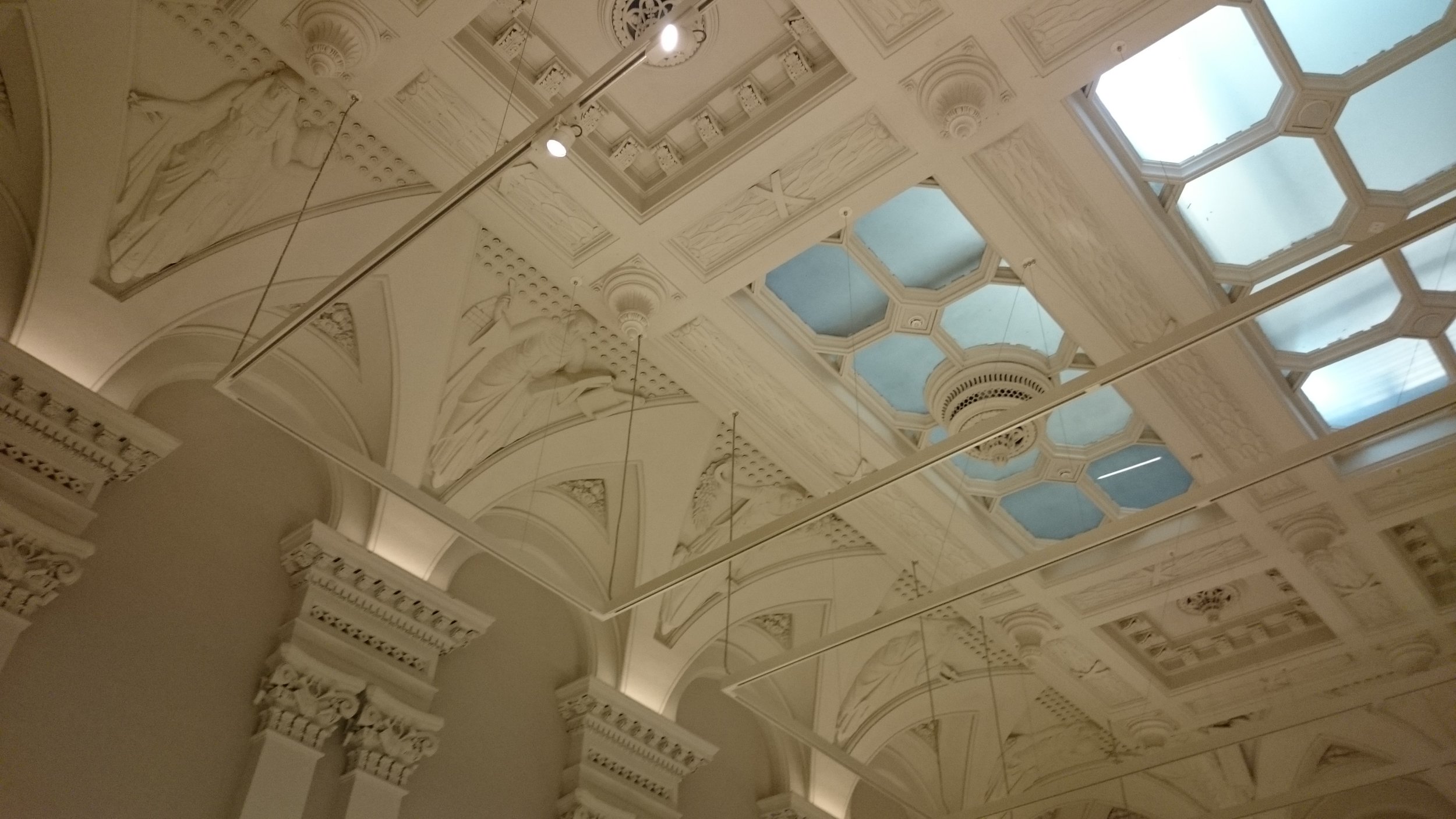
the gallery space was beautifully curated, to be honest i could have continued absorbing the atmosphere (and possibly nodding off due to such serene conditions!) for hours, but had to make a dash out into the real world and rain... boo! the pieces looked amazing against the original architectural features of the building and the display cases filled with natural stone and lit beautifully complimented the pieces to perfection. the graphic communicator responsible for this exhibition did themselves proud, from the simplicity of the long communication banners, to the super clever, yet simple perspex description boards. yes, yes, i am a super geek to waffle on about this, but also totally appreciative of the contribution to the overall feel... beautiful.

seriously, if you get chance, it's on until jan 2017 - go, go, go see this exhibition and connect with your inner zen!


Source: http://manchesterartgallery.org/exhibition...

feedback fantastico!

really pleased (and super proud) to receive some great feedback on a recent project...

โ€œi had a chance to work with kate on the dining club by ikea project in shoreditch, london. with her creativity, attention to detail and great knowledge on interior design, kate has been a real asset to the project. on top of that, she also has great organisational skills, which led to a smooth planning process as well as the implementation on siteโ€
— agnieszka wojcik - design project manager, ikea
โ€œso many thanks for all your help with the shoreditch event - the feedback has been amazing and the photos have gone global! your ideas, hard work and endless enthusiasm were much appreciated and i hope we get to work together again at some point in the future.โ€
— jill reedman - deputy country design manager, ikea uk and ie

vogue with added extras...

took a trip to manchester city art gallery this week and what a treat! i've not managed to get there for a while, but always have fond memories from sketching and photography projects in college and uni days :) anyway i digress..?!

so, my main reason for visiting was the 100 years of vogue exhibition that i'd missed while it was on at the national portrait gallery earlier this year, so how giddy was i when i found out that it was also showing in manchester. for anyone that loves vogue magazine it's obviously a no brainier, but also for anyone that loves fashion, photography and glamour it's a fantastic show. it's really interesting to see how the covers and content have changed over the years. i seriously had to restrain myself to adhere to the no photos rule, but it's on until oct 30th so if you get chance head on down there for a nosey.

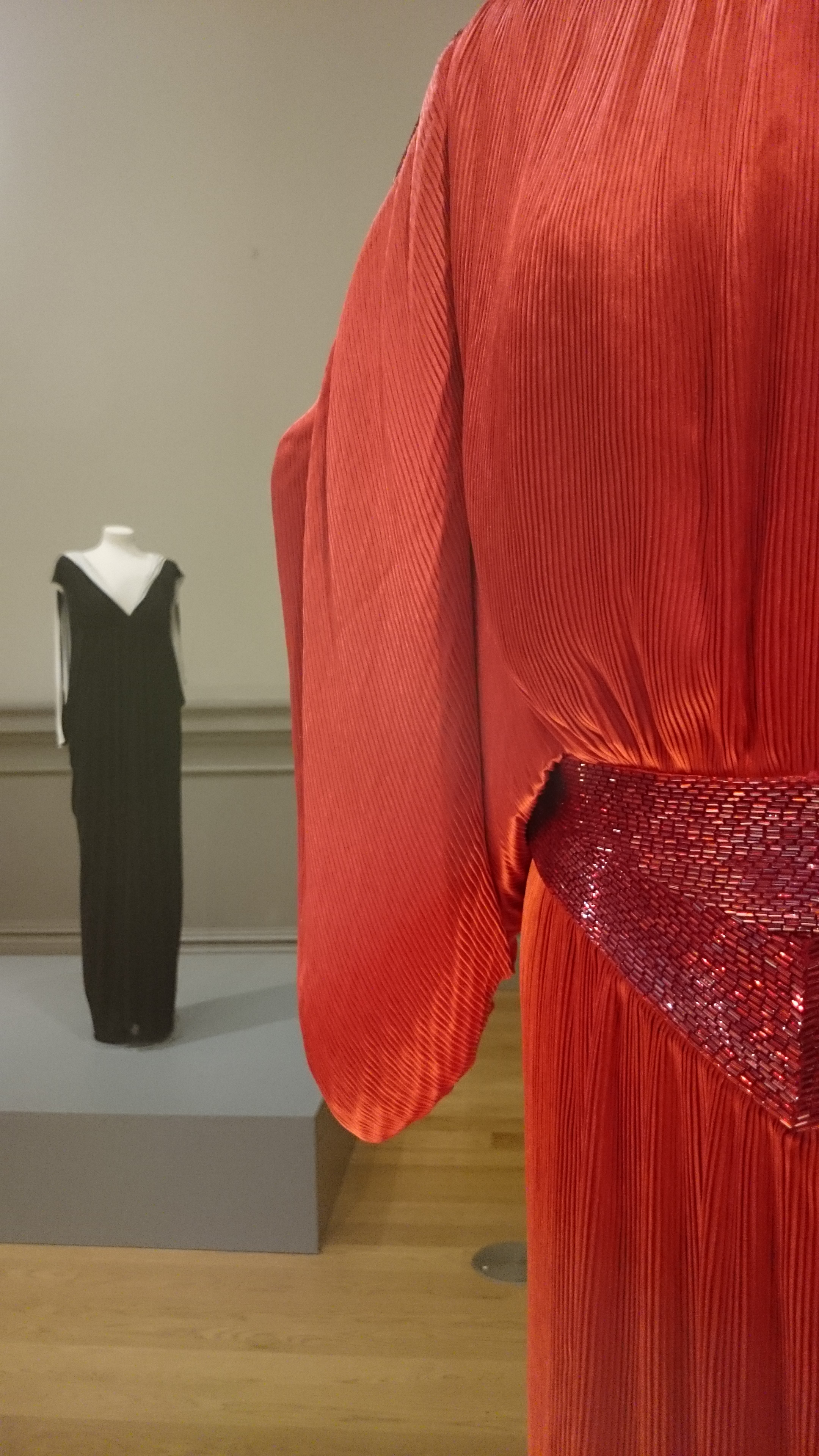
the added bonus was the 'fashion and freedom' exhibition. a fantastic exhibition questioning how the war impacted on women's fashion, bringing together existing period costumes from the gallery's collection and designs from some of today's top fashion designers including vivienne westwood, roksanda and emilia wickstead to name a few.

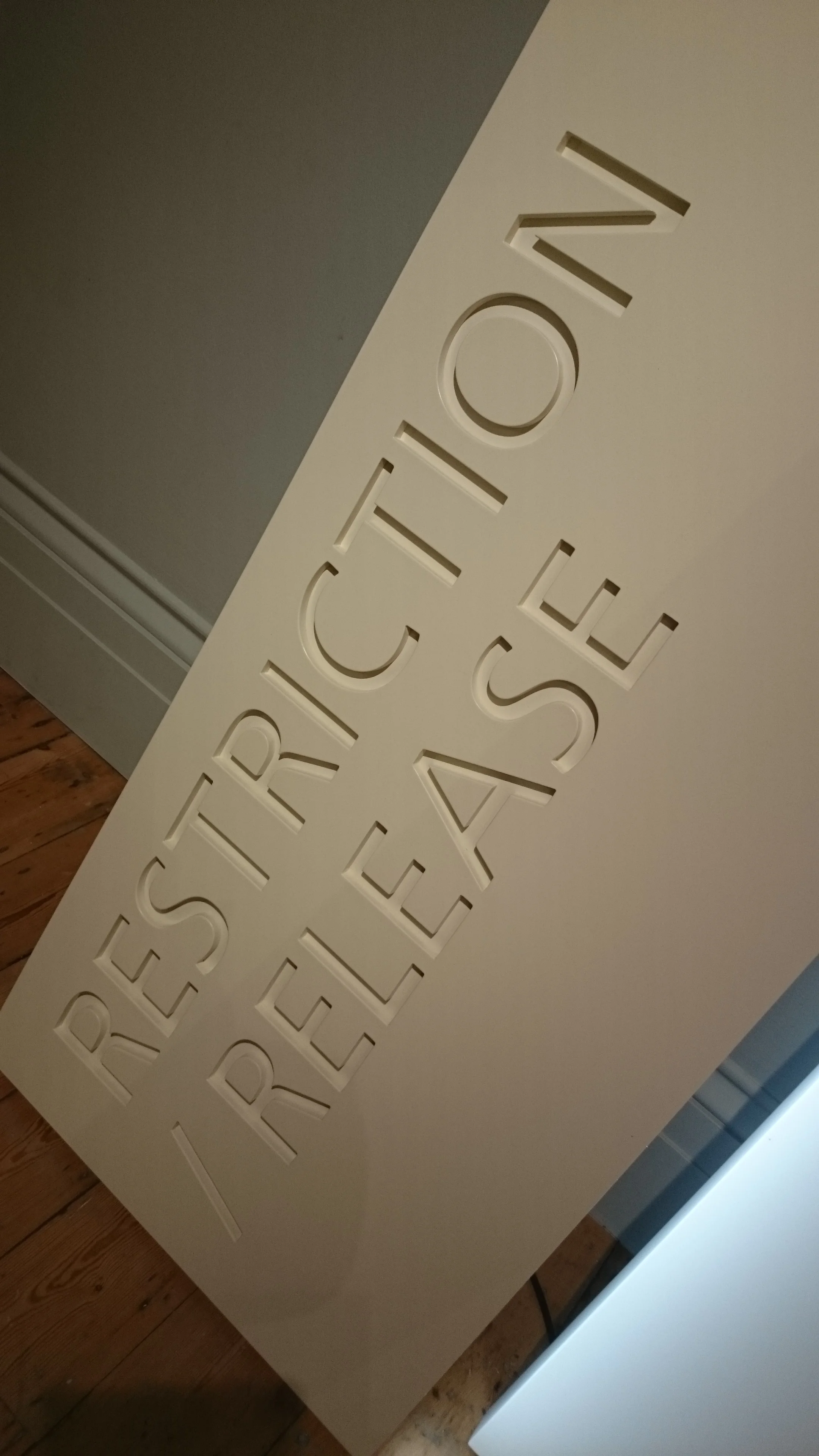
personally though, it was the inclusion of some seriously talented fashion students from around the uk that were the highlight. they worked with the brief of 'restriction/release' during war time, expressing what it meant to them through their designs. at first glance some of the creations are a little crazy?! but when you read and listen to the stories and thinking behind them, you can't help but be impressed by the creativity and skill in their execution. seriously worth a visit, but until you get chance check out just a small % of the seemingly endless photos i took..!


food for thought...

finally I can share what iโ€™ve been working on for the past couple of months and why iโ€™ve not had much time for anything else?! iโ€™ve been part of a fantastic team working with ikea to design and install โ€˜the dining clubโ€™ in londons shoreditch โ€“ a pop-up diy restaurant, cafรฉ, shop and general hub of inspiration!

the whole project and installation is focused on how food can encourage people to spend more time togetherโ€ฆ cooking it, as well as eating it and the dining club offers people the chance to have their very own restaurant and cook alongside a chef for a group of their friends โ€“ pretty cool eh?!

the space also houses a cafรฉ, shop and inspirational showroom with demonstrations and workshops that will be running throughout the whole period and can be booked on line www.ikea.com/gb/en/campaigns/the-dining-club

the dining club on shoreditch high street will run between the 10th and 25th September โ€“ if you get the chance itโ€™s definitely worth a visit! #makemorethanjustfood

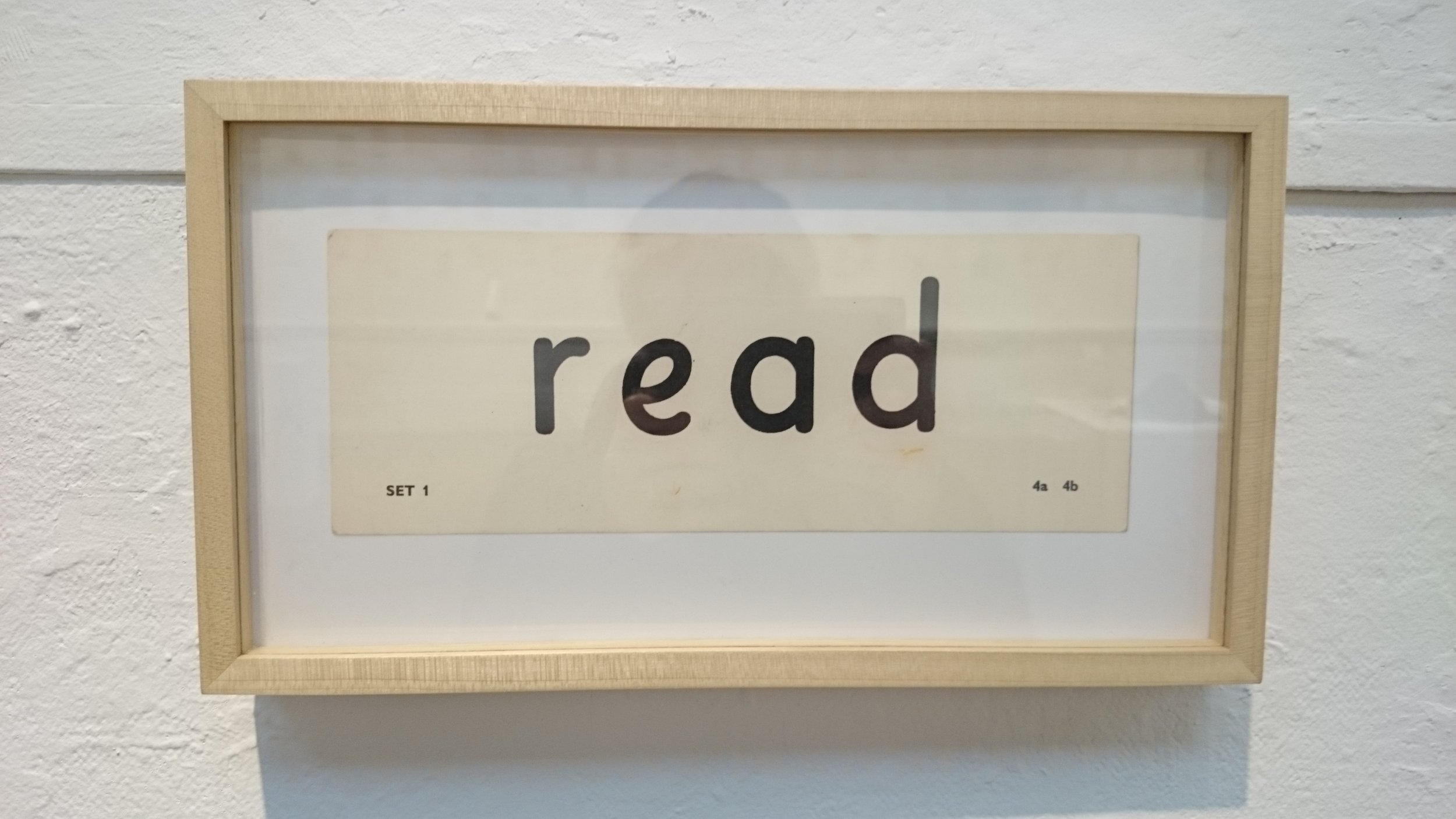
reading and waiting!

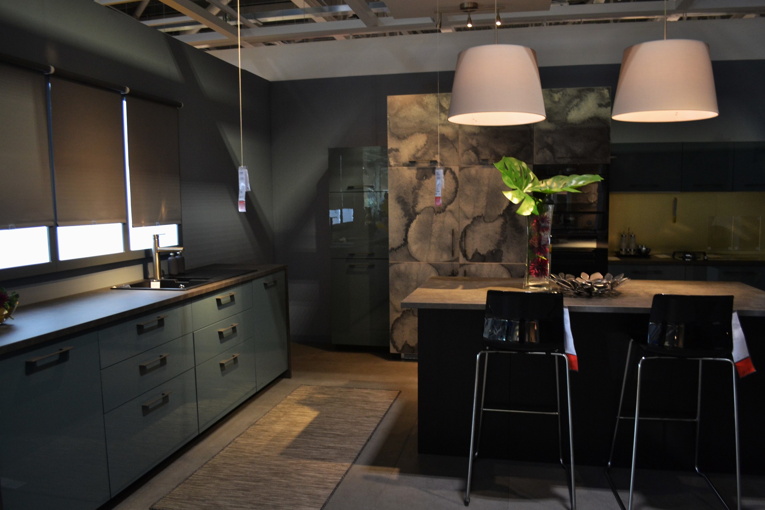
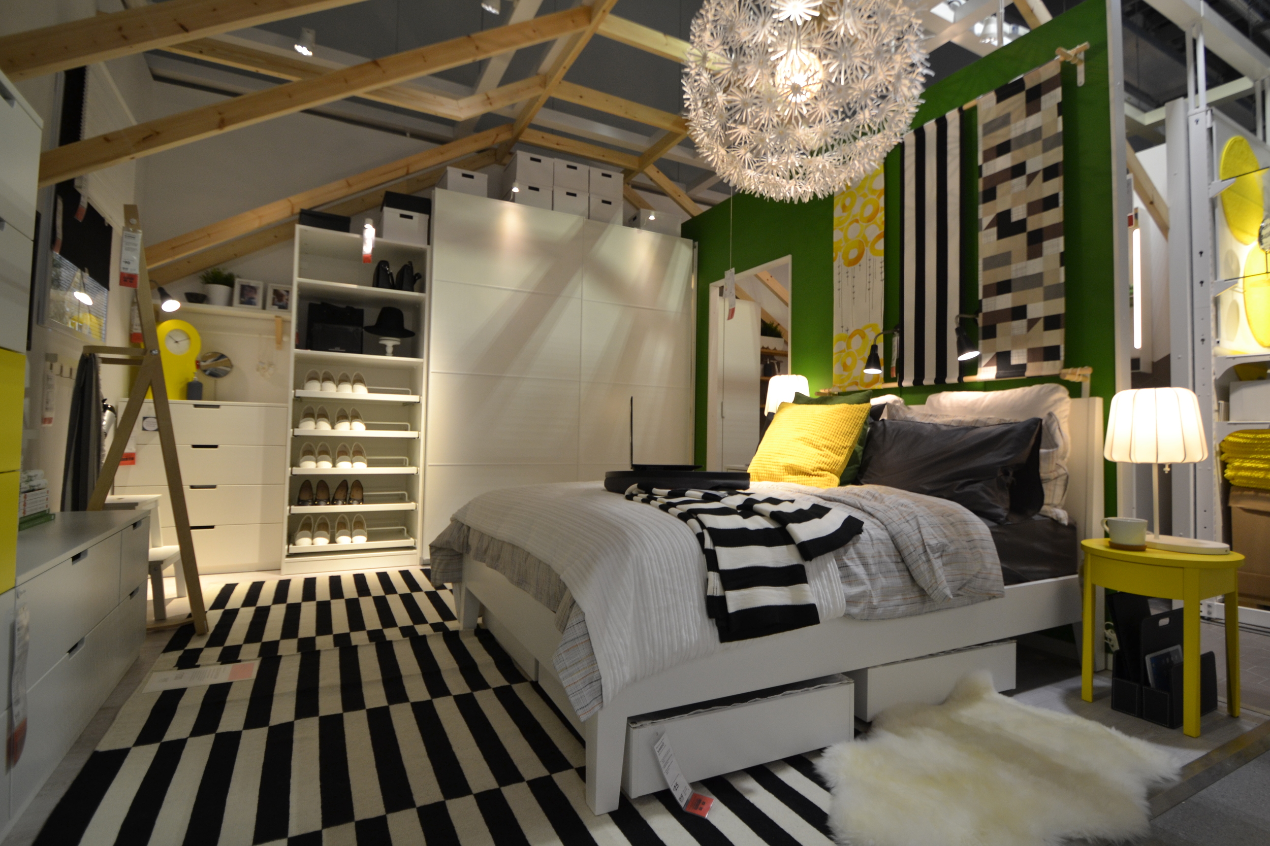
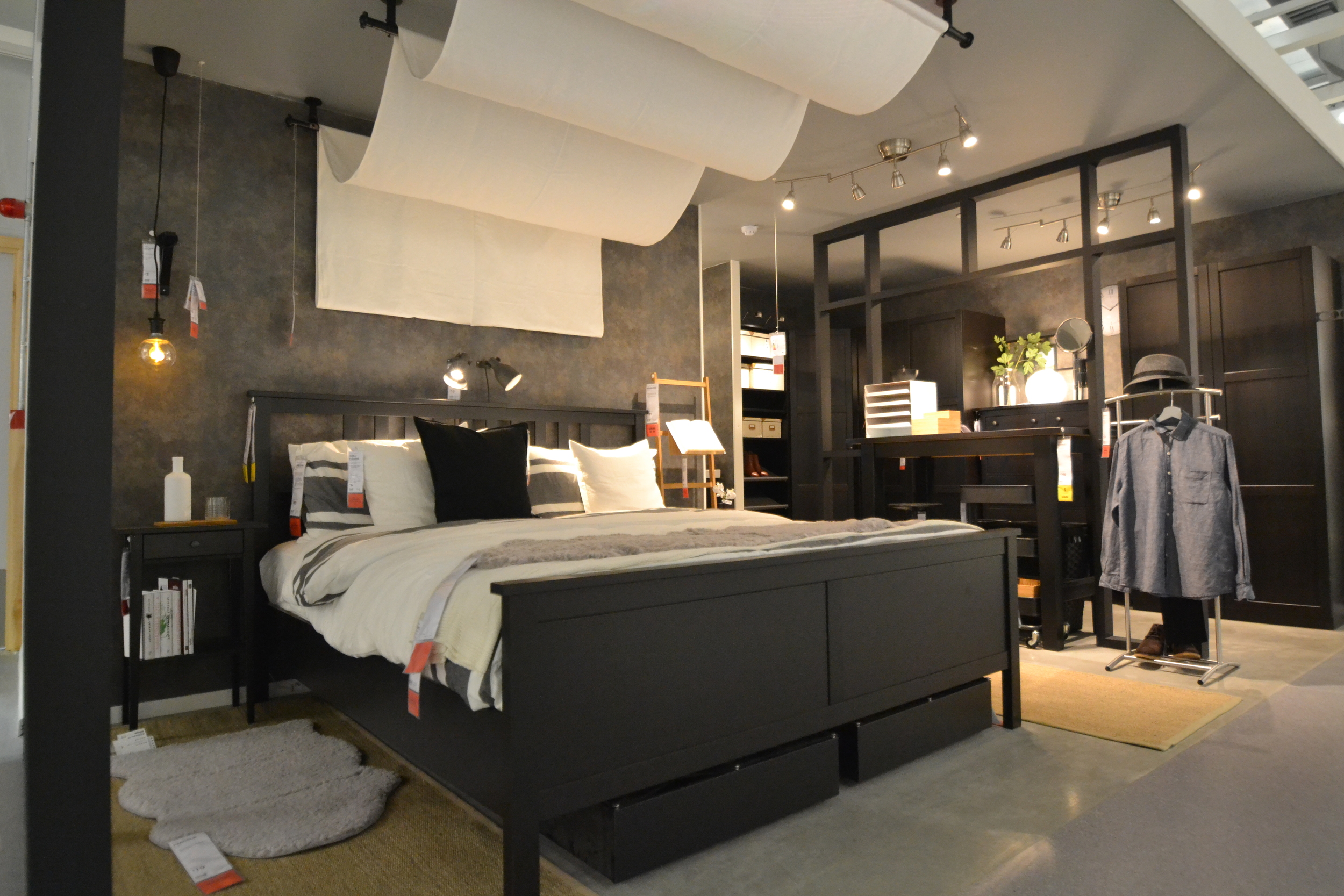
woo-hoo! last thursday saw my latest project finally come to fruition. the brand new ikea store that I have been supporting in reading, opened its doors to the public to an amazing response. this is the first store that ikea have opened in seven years and it was really fantastic to be part of the team that helped build it.  

i can only take credit for the actual โ€˜designโ€™ of one roomset (above), but it was my responsibility along with the super talented design team and lots of contractors, to ensure that all 52 roomsets and other inspirational areas in the showroom, were constructed and installed to plan and more importantly on timeโ€ฆ a huge task, but an what an outcome! check out some of the photos below and get inspired too :) and finally for my dream team, what this project meant to me #proud #inspired #friends #b&q

happy client!

just received some lovely comments from a recent client who wanted some help and advice for her living area...

"i contacted lemonpebble design after deciding to refresh my lounge and dining room but i wasnโ€™t sure where to start. i knew what i liked and also what i didnโ€™t, but wasnโ€™t sure how to pull everything together and make it work. at our first meeting kate spent time getting to know me, my space and how it was used and then pulled together a lovely, fresh scheme incorporating my love of retro styled furniture. kate helped me visualise the finished look by providing moodboards, plans and 3d visuals and even assisted with the final styling. iโ€™m extremely happy with my new space and love the calm colours and feel just in time for summer."

inspiration, inside and out...

taking advantage of a bit of free time whilst the hubby played yet more golf! i met up with a good pal at the hepworth art gallery in wakefield, yorkshire and what a beauty it is! the gallery takes its name from the artist and sculptor dame barbara hepworth who was born here. designed by david chipperfield and opened in 2011, the architectural features of this building rival the beauty of the artwork it contains and i cant believe i'd not visited before?!

built with natural light in mind, the large windows are positioned to frame local landmarks and the light shafts in each gallery allow the space to be illuminated in a church like way, but easily adjusted when necessary. for our visit the unpredictable june weather provided stormy skies and sunshine which created a perfect backdrop...

we'd initially decided to take a trip over to see the new stanley spencer exhibition, but the gallery also houses lots of other great pieces, obviously by dame barbara herself, but also henry moore, miro and ben nicholson to name a few. all in all a fab day getting inspired, a bit wet and catching up with a good friend :) 

and relax...

iโ€™ve not been great on the blog front recently so apologiesโ€ฆ im currently working on a fab retail project in reading which is due to launch in july. itโ€™s really exciting, is looking amazing and I cant wait to share some photos when we open! but, as with all great projects comes hard work and recently iโ€™ve been pooped โ€“ hence the lack of conversation on hereโ€ฆ work, eat, sleepโ€ฆ work, eat, sleep โ€“ you get the picture?! so, when i got the opportunity to do something creative and relaxing this weekend i jumped at the chance and what a great time i had :)

lucky for me one of my friends is a super talented ceramic artist who happens to have her own studio, with real clay and everything! and is looking to start sharing her knowledge and skills on creative day courses. so, along with two other friends we embarked on a โ€˜clay dayโ€™ full of extruding, rolling, scoring and most importantly creating!

okay, im no clarice cliff  https://en.wikipedia.org/wiki/Clarice_Cliff but i did okayโ€ฆ my mug was a โ€˜bitโ€™ on the large side and is now a vase (as long as it holds water?!) but we had a fantastic day with lots of laughs, great hospitality, refreshments and a couple of glasses of bubbles (be rude not to)โ€ฆ check out the photos to prove it.

id definitely recommend for anyone to have a go, great for small groups of friends, birthday or hen celebrations! let me know if you want more details :)

smart art!

caught up with a great friend last week and had another fab visit to the whitworth art gallery in manchester, this time to check out the ben rivers and nico vascellari exhibitions and we werent disappointed. exhibitions aside the whitworth is a beautiful space to spend time, especially when the weather is good and you can take advantage of the views over the park whilst having coffee and a cake! got some great inspiration, not just in the gallery, the gift shops are pretty great too!

market research...

a highlight of my recent trip to vienna was the naschmarkt โ€“ an amazing outdoor market selling everything from clothing and jewellery, to spices and tea. I love a good market at the best of times (my local town has one of the best markets around โ€“ official โ€“ big up to bury market!) but the colour and pattern at the naschmarkt is a feast for the eyes and the aromas from the many food stalls make your mouth water. itโ€™s a great place to explore, enjoy some culinary delights and maybe a glass of champagne?!! To be fair they donโ€™t have that on bury market, but they do have cafes that do a great brew!

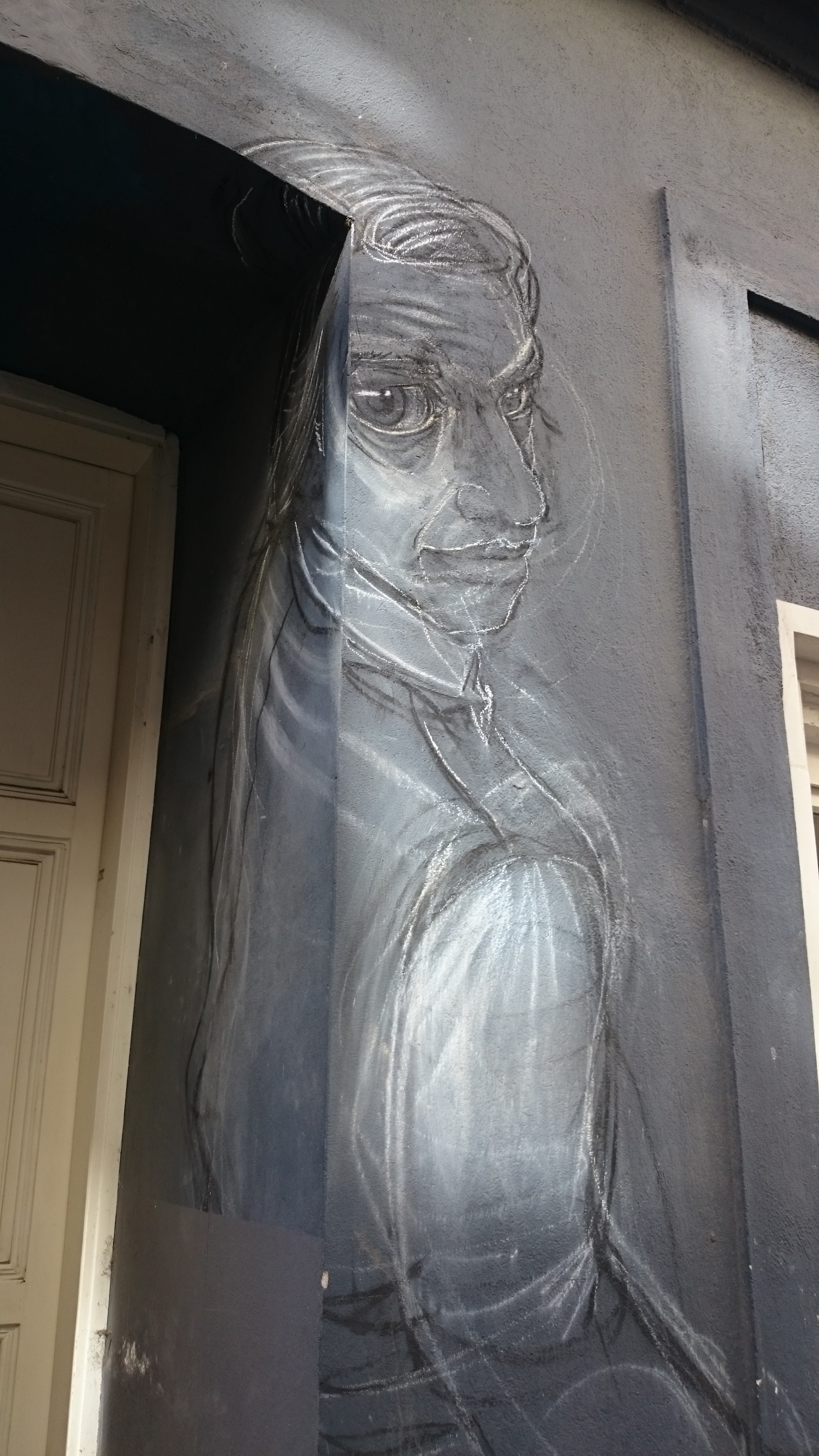
ohhhhh vienna!

one of the plus points about travelling with work, is the hotel loyalty points I stack up. so the hubby and I recently cashed some in and ventured to the very beautiful city of vienna. home to apple strudel, schubert and eurovision 2015. vienna is a fantastic city, super friendly, really chilled and with amazing architecture around every corner, itโ€™s a great destination. check out some of the things that inspired me on my visit, from the traditional, to the just plain weird โ€“ beauty they say, is in the eye of the beholder ;)

all things bright and beautiful!

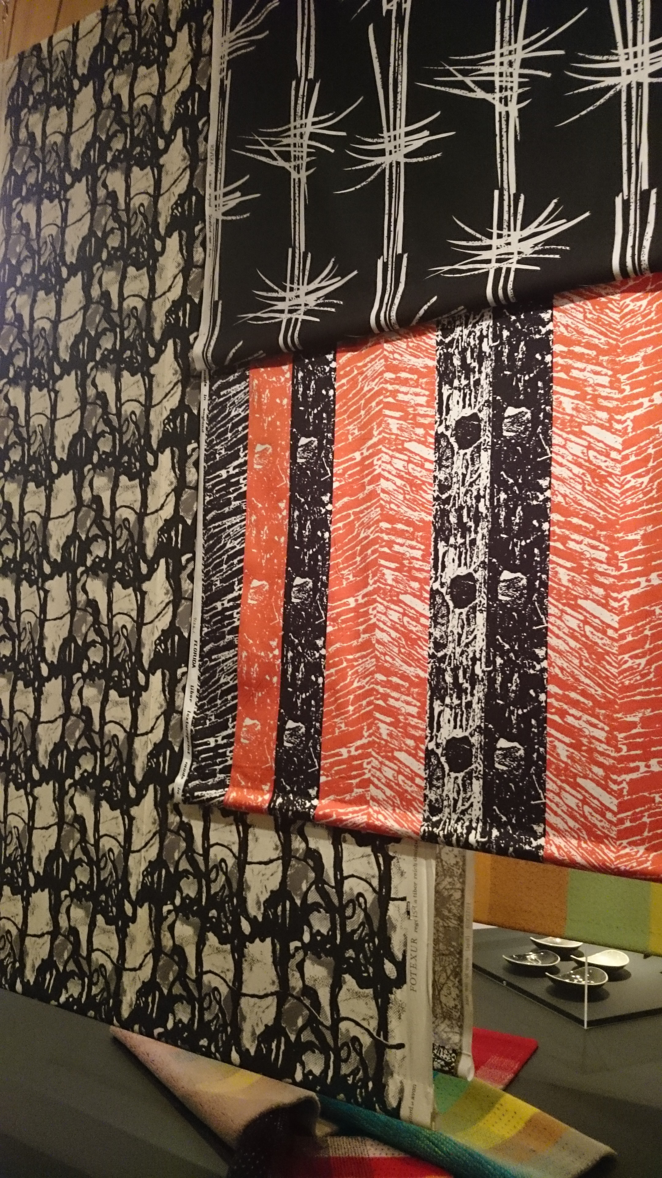
with the weather being so vile recently, I thought it was about time to chase the grey away and inject some extra colour in my day, so it was great to learn that the whitworth art gallery in manchester was hosting an exhibition by the textile artist tibor reichโ€ฆ and mr reich can definitely do colour! born in budapest, reich studied in vienna before moving to britain and starting tibor ltd. here he used photography to help create amazing textiles with colour and pattern. his talents werenโ€™t limited to printed textiles, he created ceramics, rugs and his own house was a wonder of new building techniques and innovative materials. check out the exhibition if you get chance, itโ€™s on until august. for a taster have a look at my photos belowโ€ฆ

Source: http://www.whitworth.manchester.ac.uk/what...

when in rome...

inspiration overload! last week i was lucky enough to take a trip to rome with some great friends (and the hubby of course!) and seriously, that place is beautiful. the architecture is something else. wherever you walk there is another building that seems more stunning than the last and that's before you go through the doors and take a look around?! the colours, detail and sheer scale are mind blowing and the skill of the artists and craftsmen is amazing. it makes you wonder, how with today's technology we sometimes struggle to even come close..? this blog is about getting inspired, so here are a few of the sights that got me snapping, i think you'll agree - rome definitely wasn't built in a day?!